
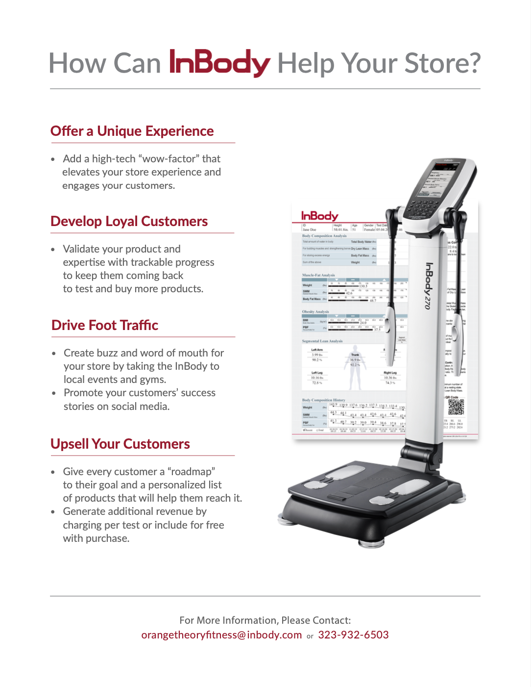
Before
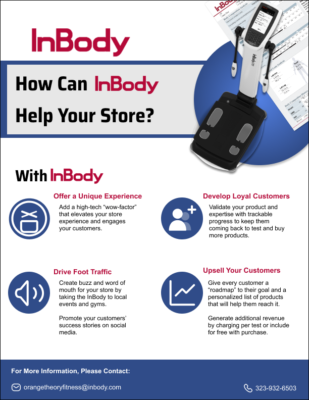
After
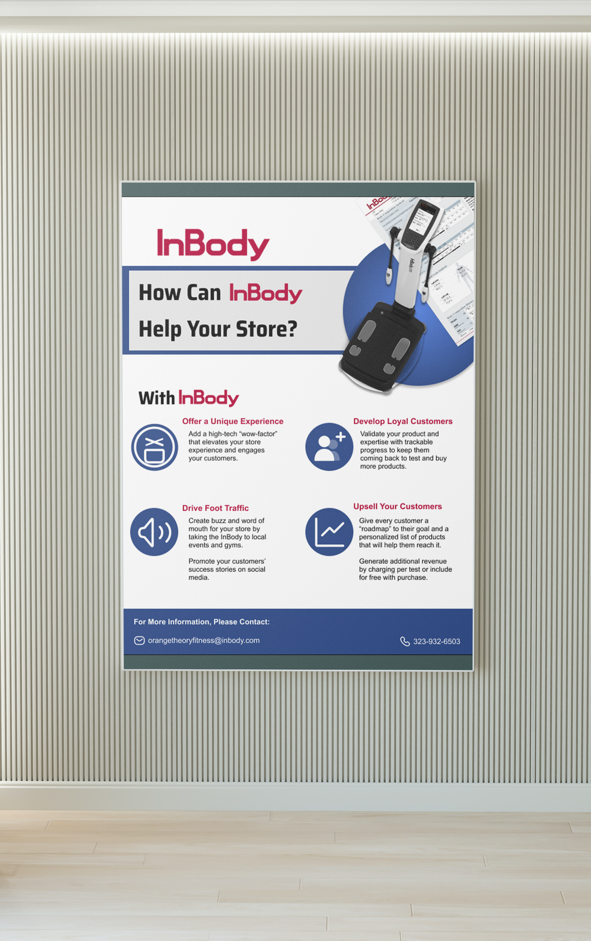
MockUp
Left: Before the flyer of the poster
Middle: Redesign of the flyer
Right: MockUp of the flyer
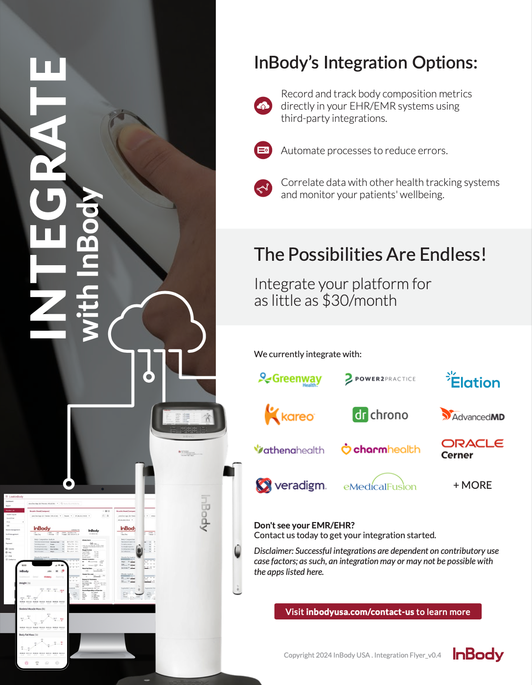
Before

After
Left: Before redesigning of flyer
Right: Redesign of flyer

Before

After
Left: Before
Right: After
Right: After
Client: Wanted all the figure illustrations to be one color, have the figures look like children, and redesign the typography by hand. I made them all one solid color so that printing would be easier and this logo could be more diverse.