
Role: Solo UX/UI Designer
Timeline: August 2023 - January 2024
Tools: Figma, Google Survey, Marvel, Miro
Tools: Figma, Google Survey, Marvel, Miro
Context
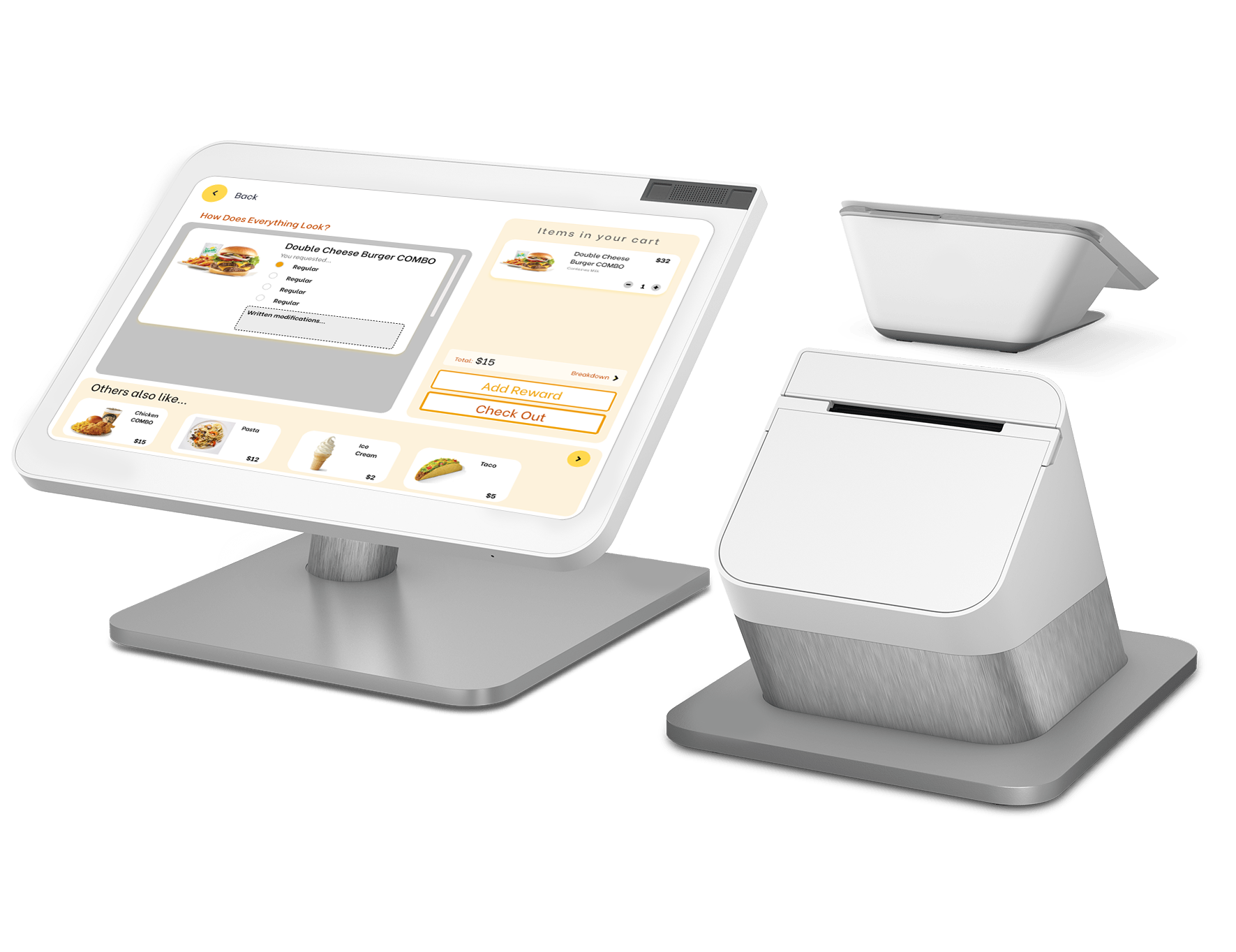
Digital menus are purposed to increase efficiency, reduce staff dependency, but many users still don't go through with the ordering process, ask for help, or feel overwhelmed. The goal of SmartChoice was to design a user-friendly experience that is clear, accessible, and minimizes confusion, that also supports customization while maintaining efficiency.
Business Problem
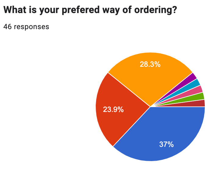
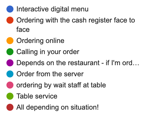
After conducting a survey of 46 participants and an interview with 5 users, I identified a consistent issue:
- The current existing kiosks reduce human interaction but don't replace clarity, customization, support, and visual accessibility
Business Impact:
After conducting a survey of 46 participants and an interview with 5 users, I identified a consistent issue:
- The current existing kiosks reduce human interaction but don't replace clarity, customization, support, and visual accessibility
Business Impact:
- Welcoming customer service feel
- When running into an issue while ordering, they would need to ask someone anyway
- Not being able to customize their order
- There isn't an image of the item
- The visuals are hard to see (text, photos, colors, etc.)
- Restaurants lose structure and customer satisfaction
- Restaurants lose structure and customer satisfaction
Thematic Analysis:
Interviewed 5 people to see what problems they have. Color-coded based on each user.
Interviewed 5 people to see what problems they have. Color-coded based on each user.
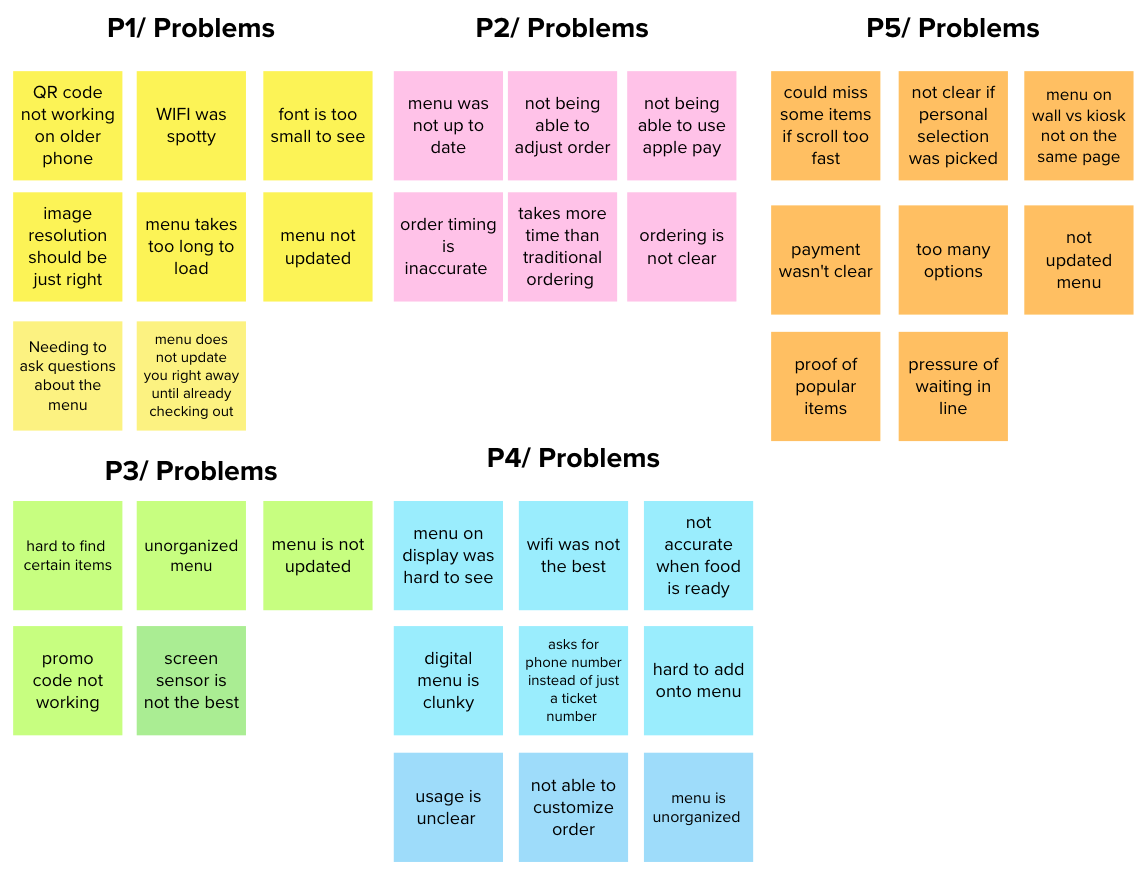
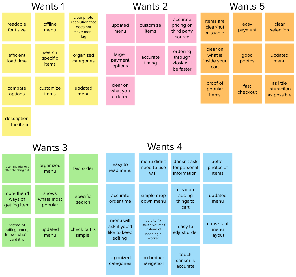
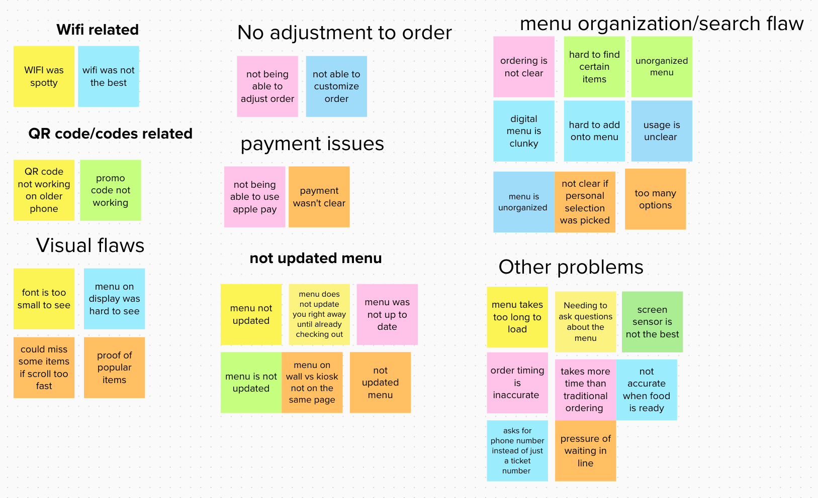
Organized based on jobs to be done. Participants all had similar problems with these categories.
Users
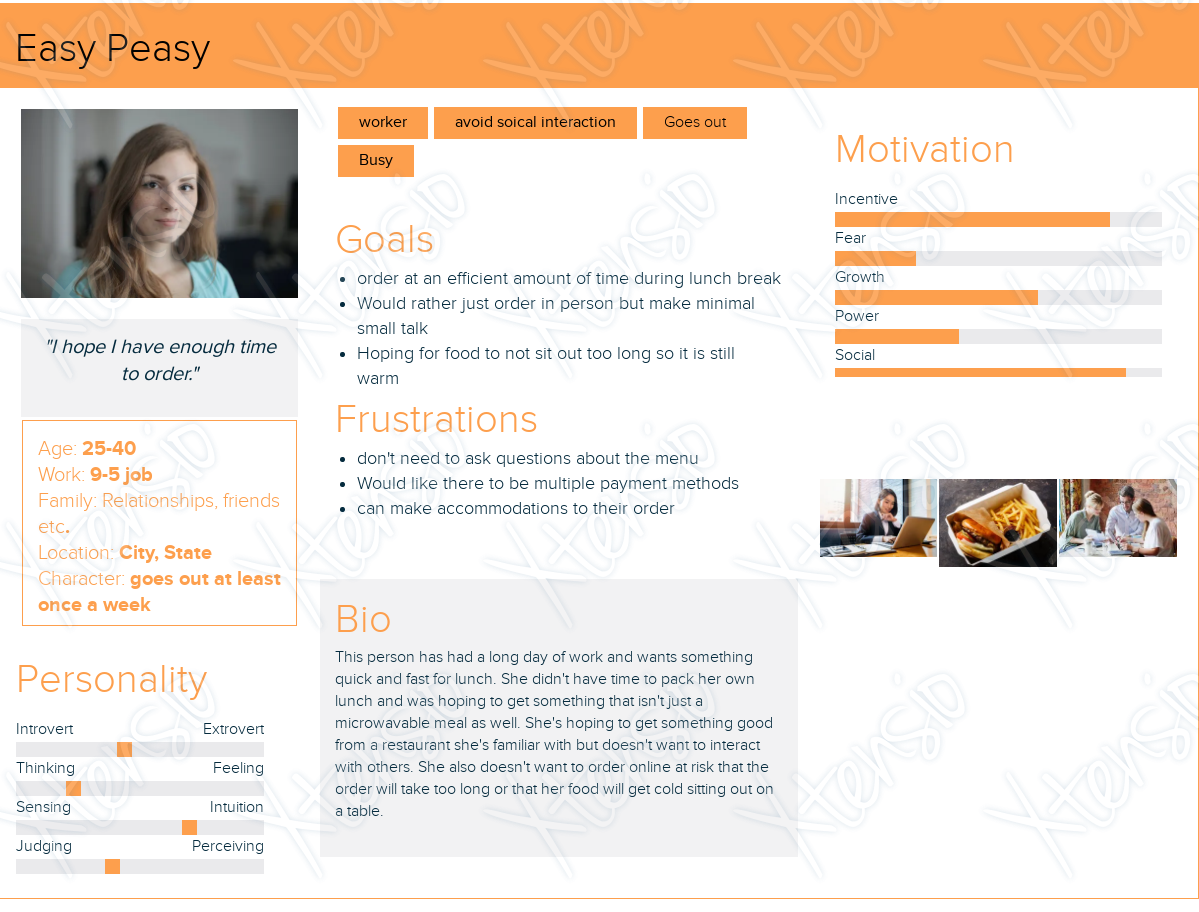
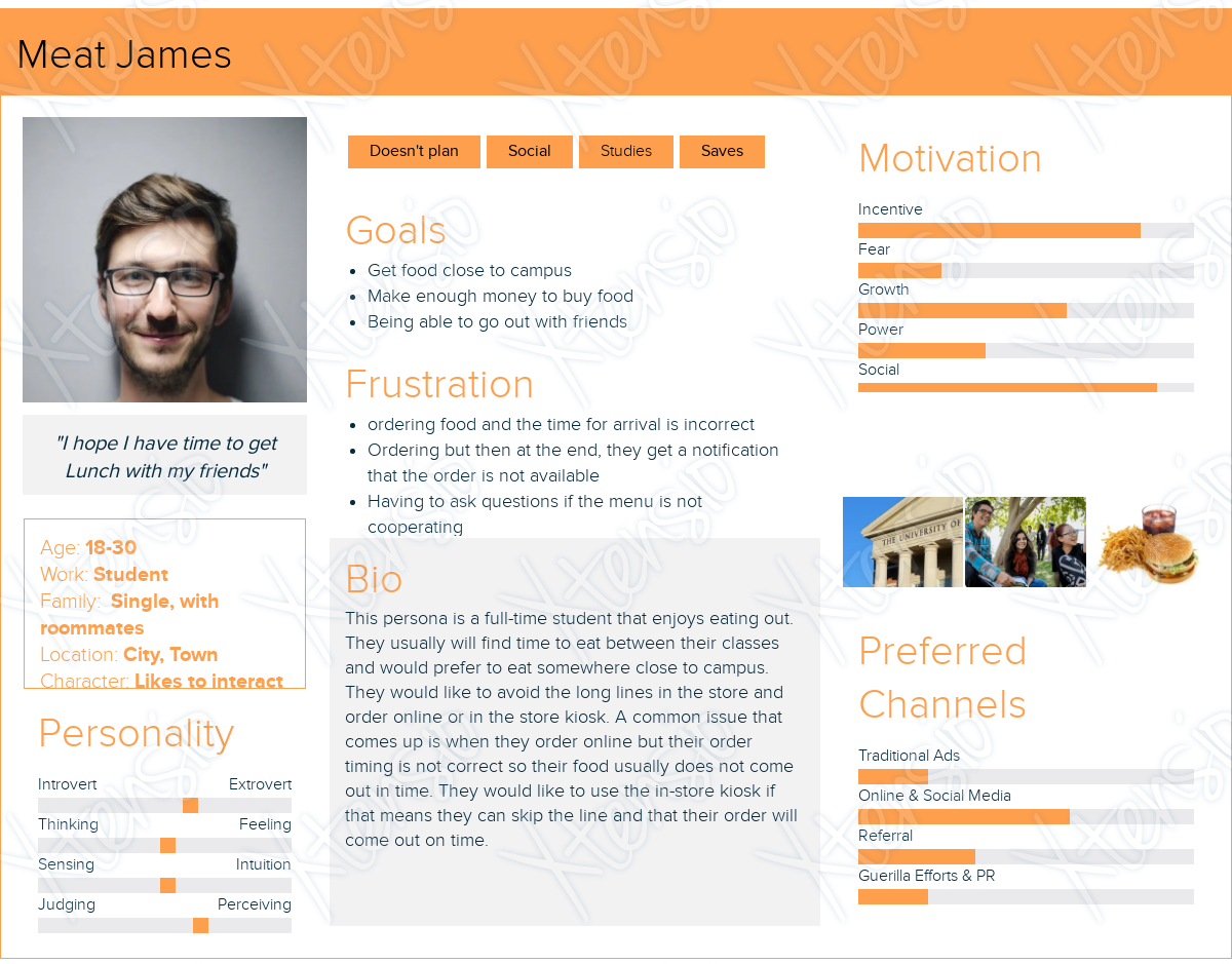
Easy Peasy and Meat James are personas that embody most of the users I interviewed. The participants I interviewed varied in age, so Easy Peasy embodies those in their early 30s, and Meat James embodies those in their early 20s. They both eat out often, get takeout for lunch, and usually avoid social interactions.
Empathy Map:
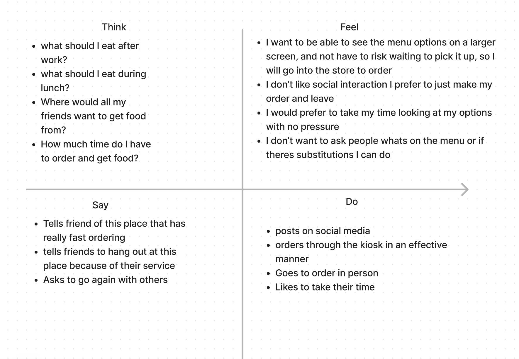
After interviewing 5 users, the empathy map covers what the user would think, how they would feel upon entering the establishment, what they would say to their friends or to outside users, and what they would do if they enjoyed their interaction.
After interviewing 5 users, the empathy map covers what the user would think, how they would feel upon entering the establishment, what they would say to their friends or to outside users, and what they would do if they enjoyed their interaction.
The process
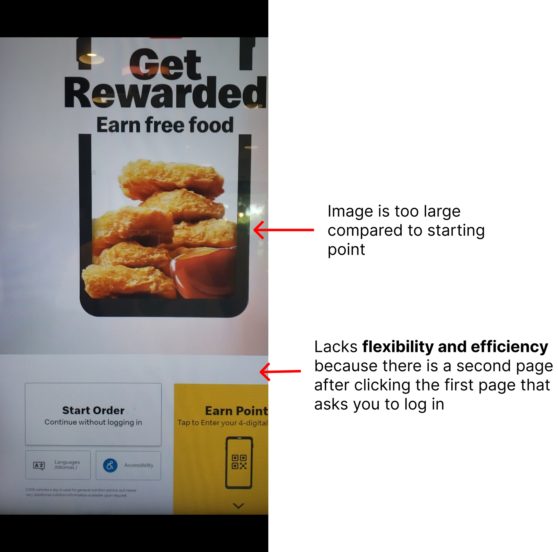
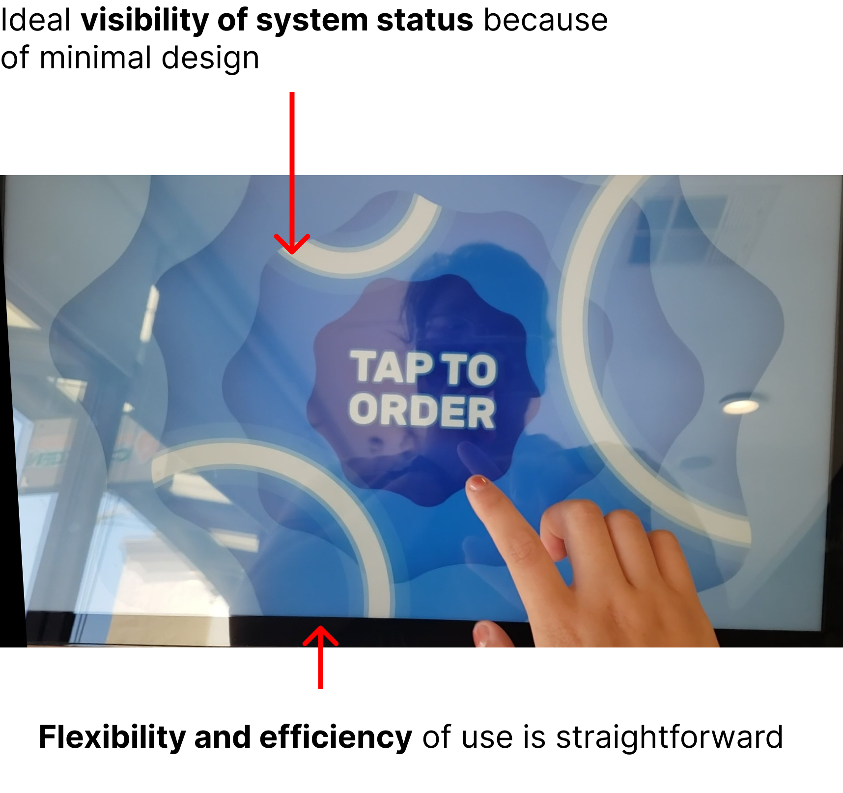
I went into 3 different establishments to get a better idea of what layouts are being used and to get inspiration from their buttons, layouts, and usability.
Sitemap
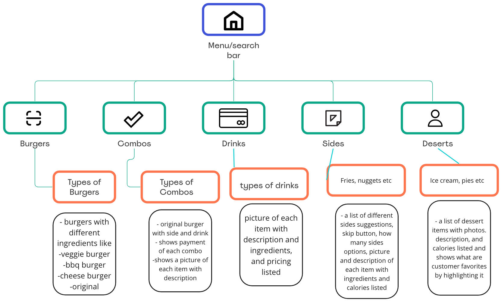
I then created a sitemap to create a backbone for my wireframes, so that it organizes the food items more cohesively. Each tab shows what items will be organized into which category.
To see the sitemap I created, check this link.
I then created a sitemap to create a backbone for my wireframes, so that it organizes the food items more cohesively. Each tab shows what items will be organized into which category.
To see the sitemap I created, check this link.
User Flow
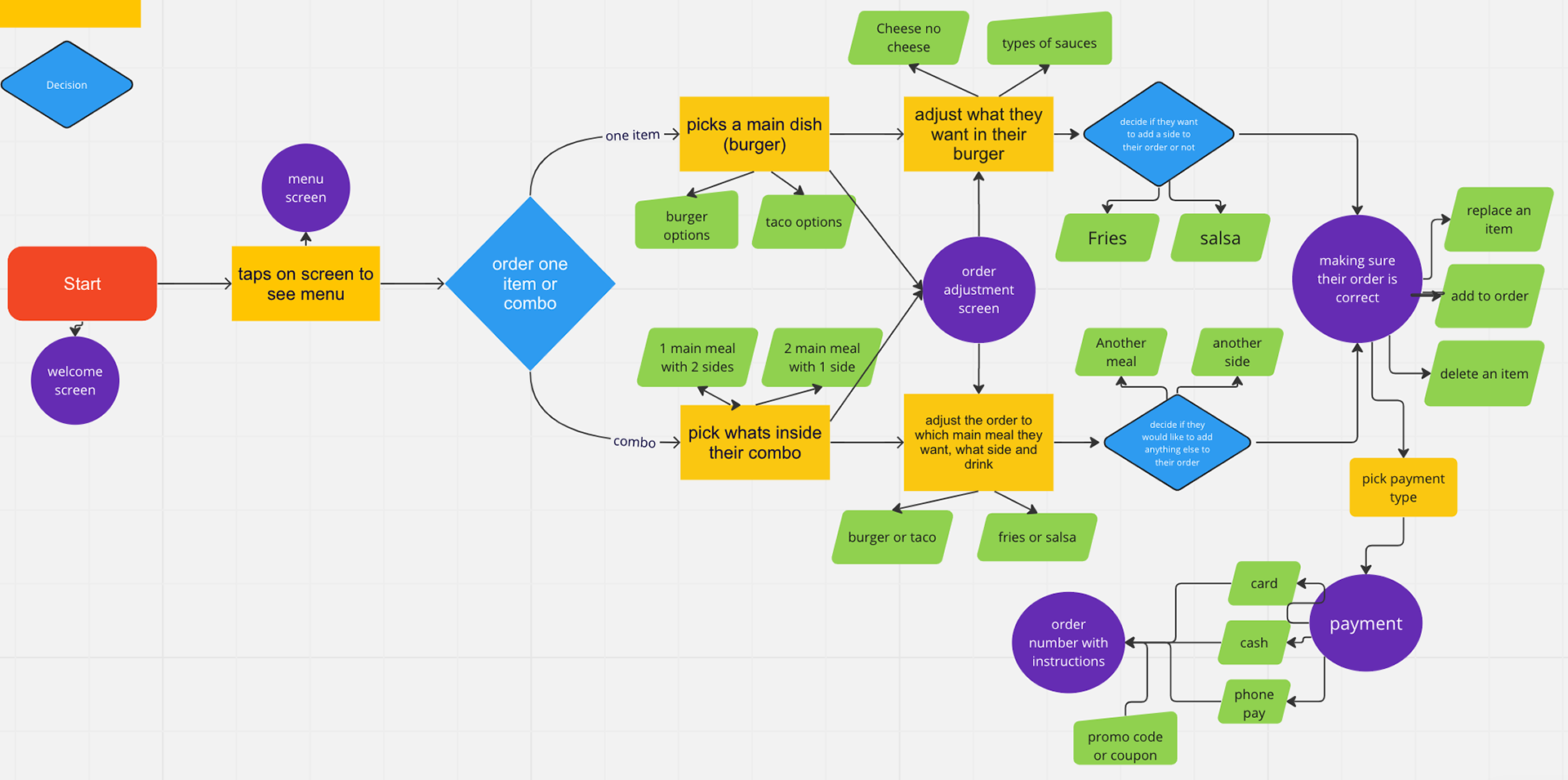
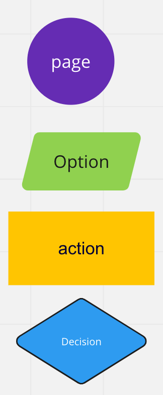
To identify the critical paths the user will take, a user flow needed to be done to see if predictions of what will happen in the flow of the menu will take place, and if I have minimized any issues that previous participants expressed in my interview with them.
To see the user flow, I created check this link.
To identify the critical paths the user will take, a user flow needed to be done to see if predictions of what will happen in the flow of the menu will take place, and if I have minimized any issues that previous participants expressed in my interview with them.
To see the user flow, I created check this link.
Sketches
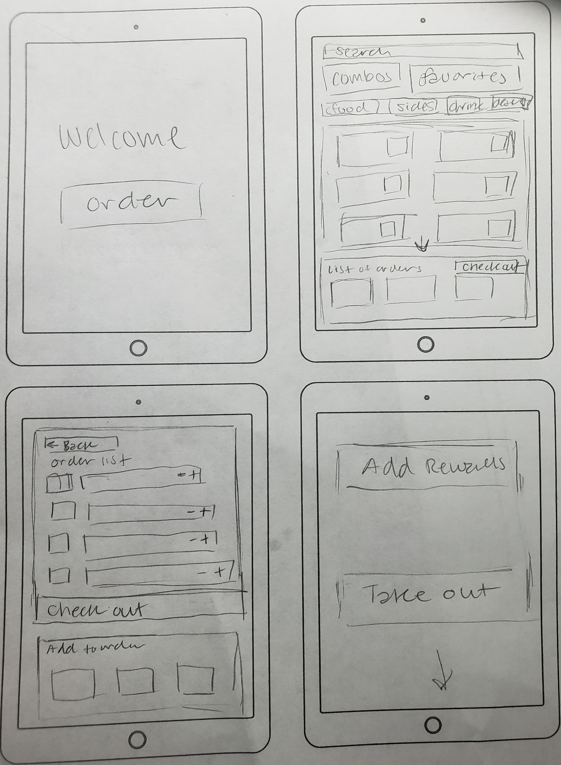
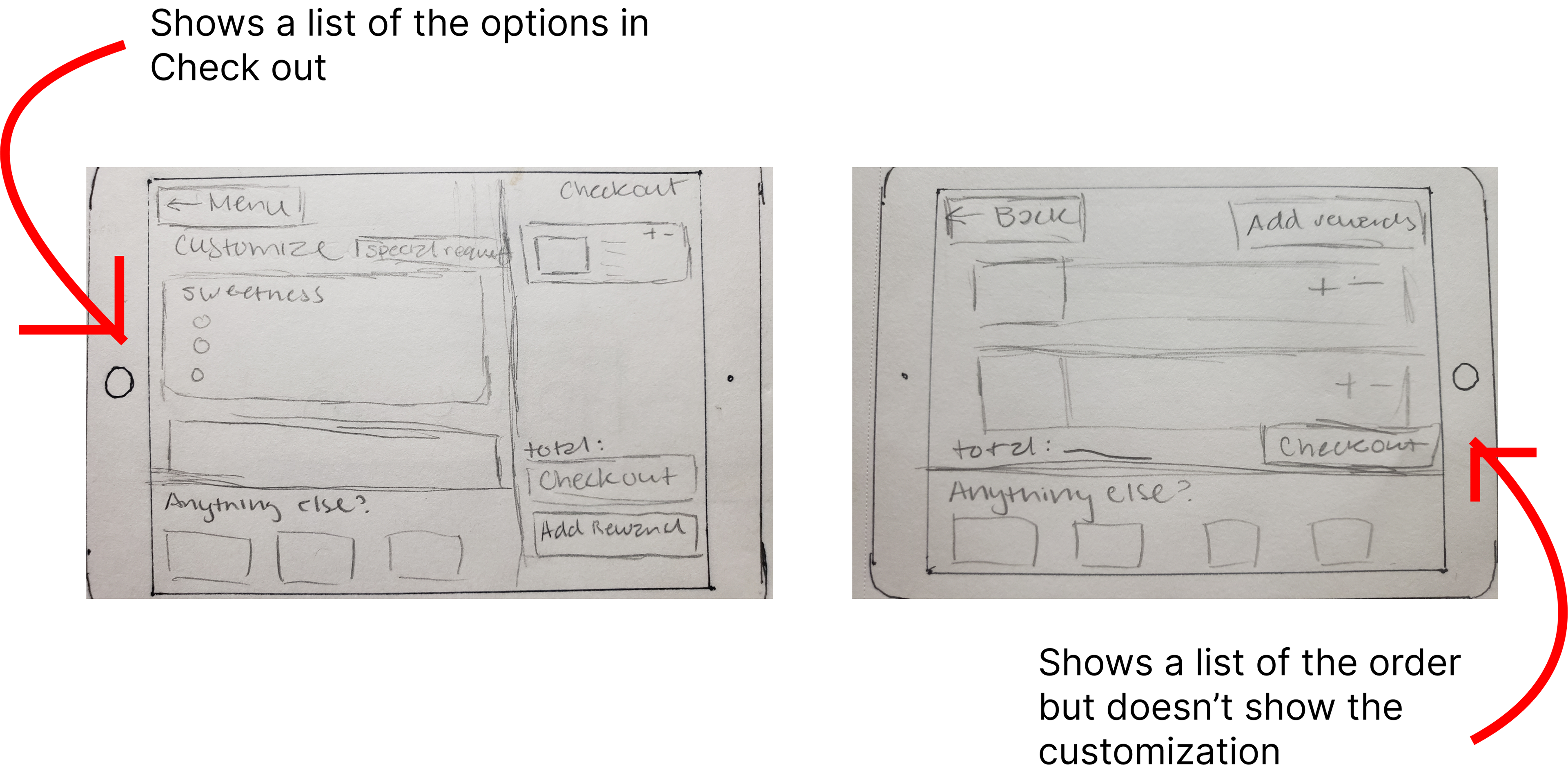
Visually seeing how the layout would look vertically (inspiration from the McDonald's kiosk), but realized horizontally, which made better eye flow.
Visually seeing how the layout would look vertically (inspiration from the McDonald's kiosk), but realized horizontally, which made better eye flow.
Wireframe
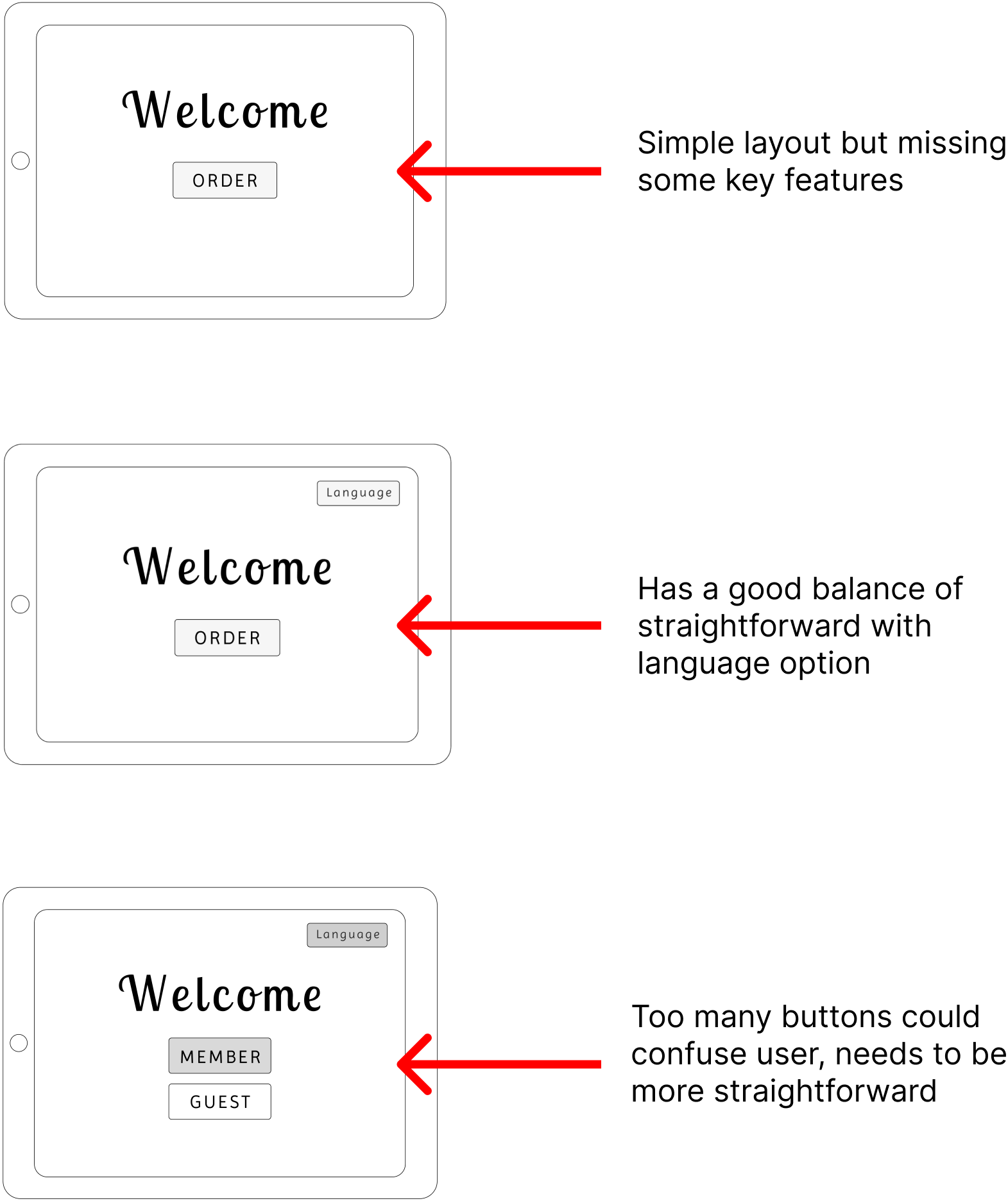
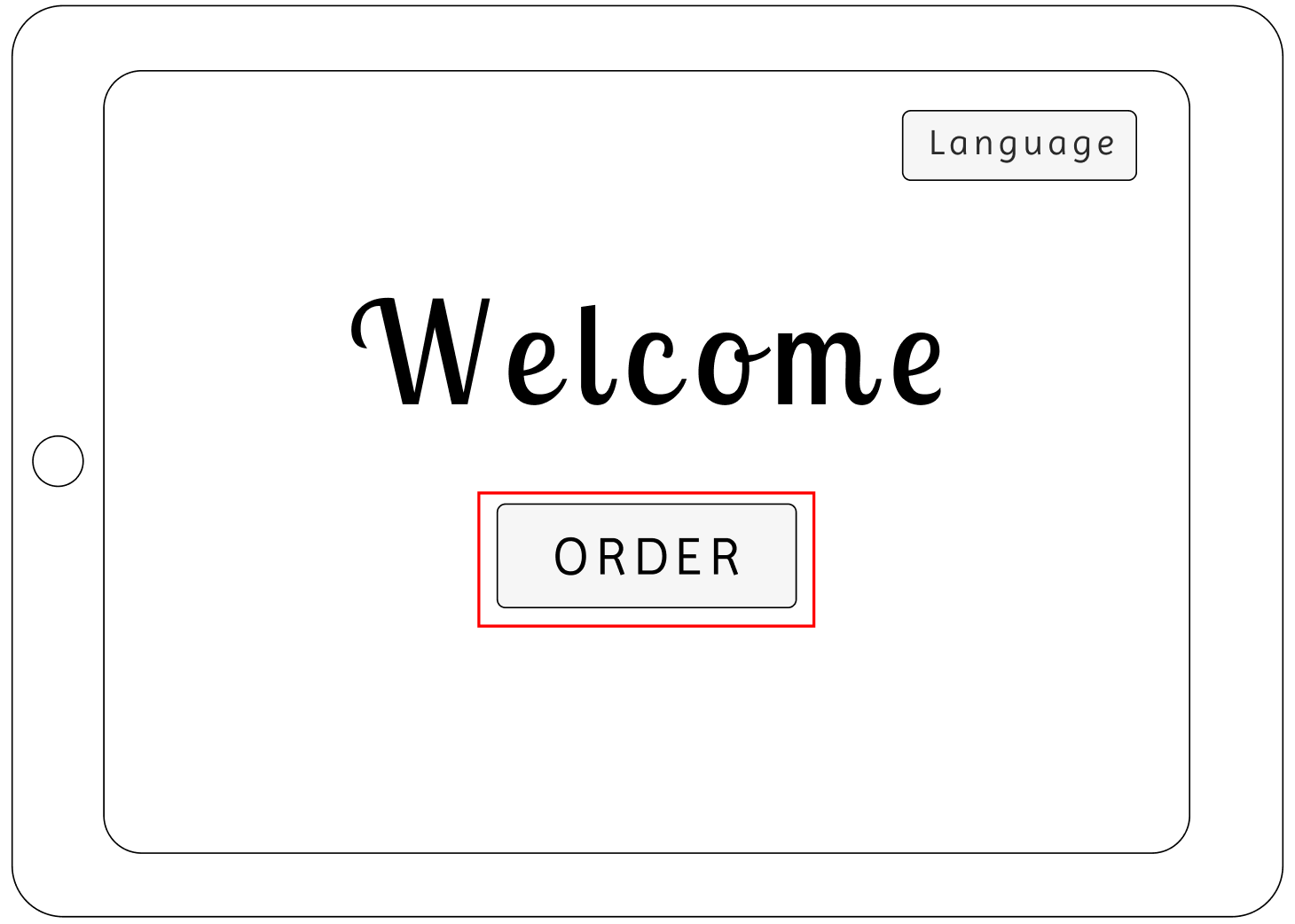
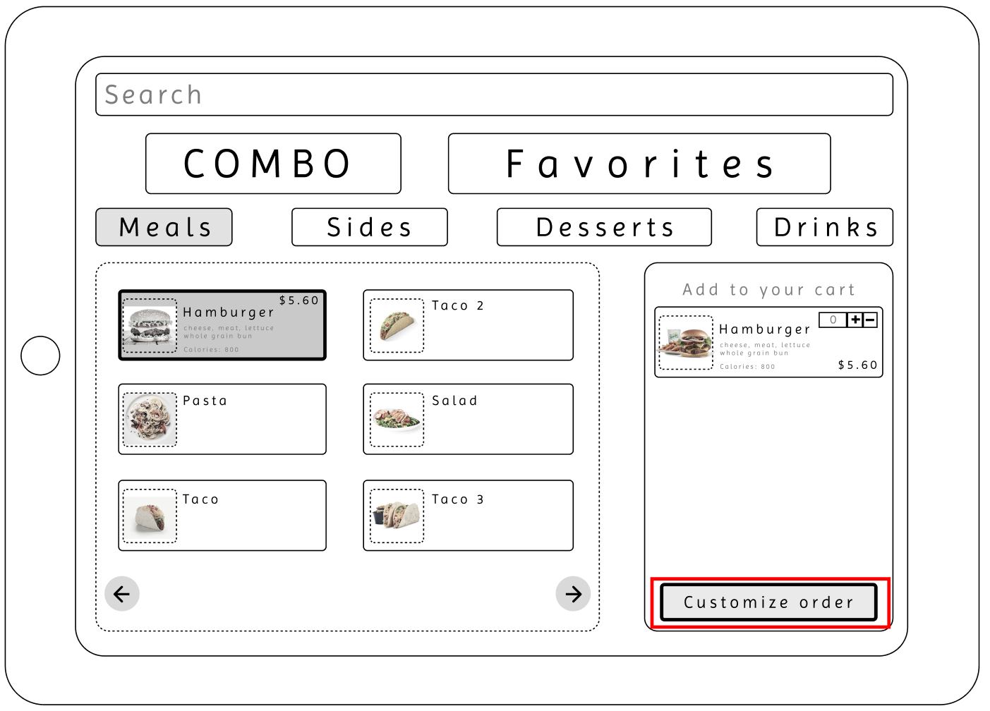
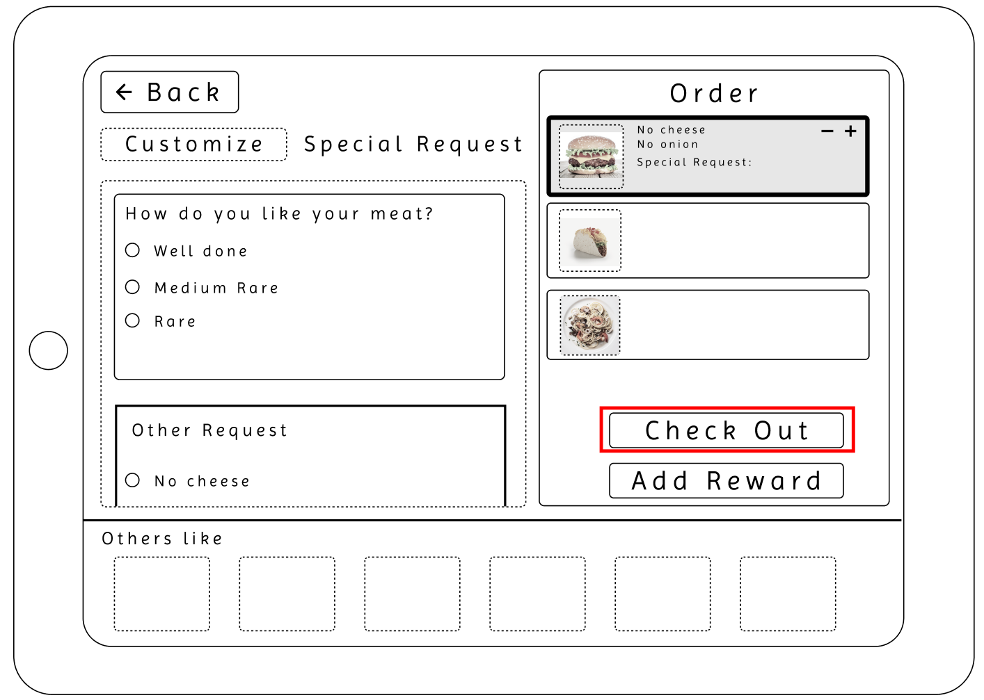
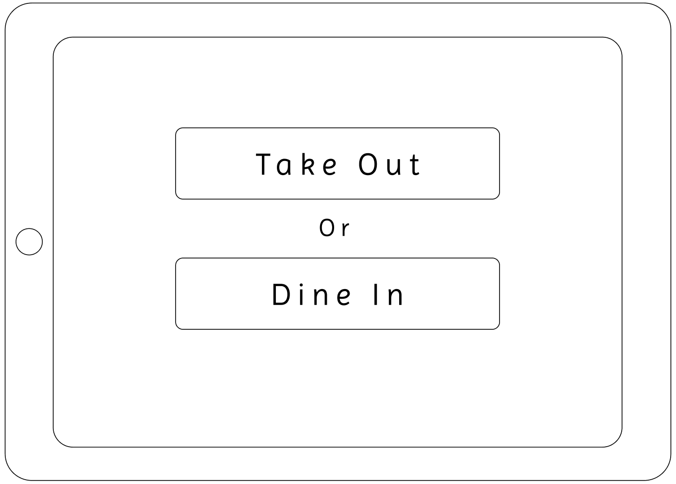
I explored the buttons for the wireframe and chose the second option since it was simple yet still effective. 5 more participants were put through a guerrilla usability test to update changes to the layout.
To see a more detailed rundown of the wireframe, check this link.
Cons
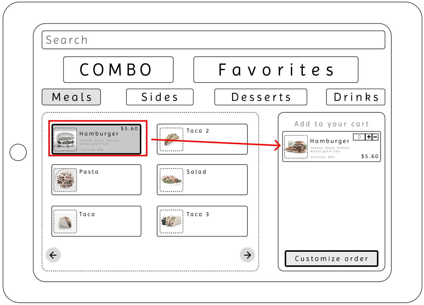
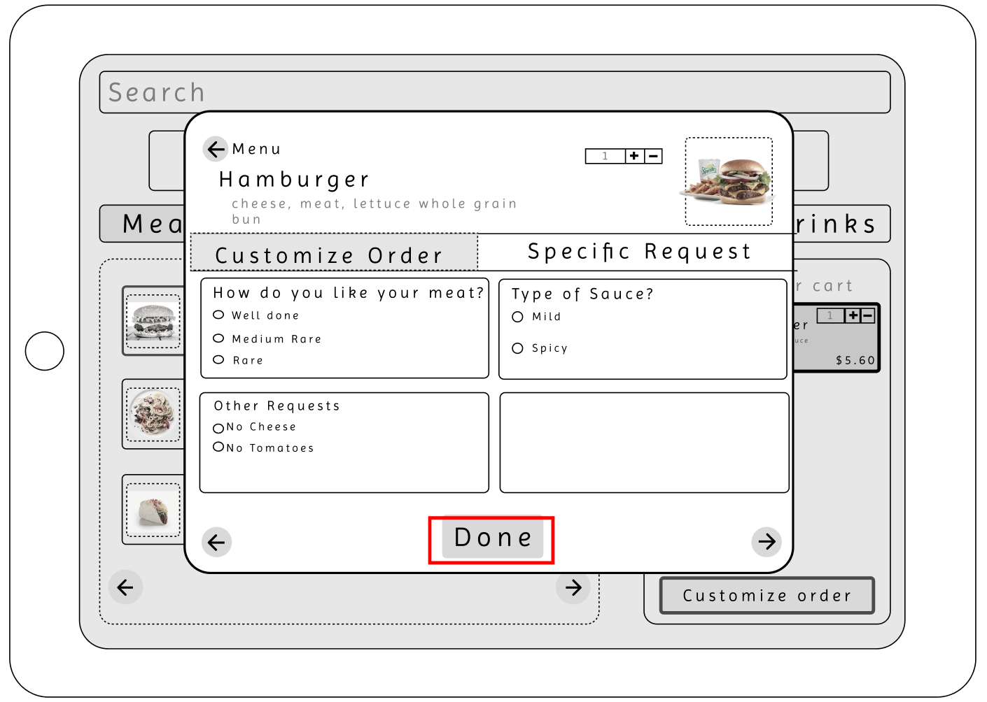
In the wireframe, I learned that participants felt thrown off by the different button sizing. Since the menu is already fairly simple, I thought that having different button sizes would help with eye movement and keep the menu interesting. Still, it was interpreted poorly, so I took it back to the drawing board, and I made sure to edit that function for the next part. Before this wireframe, there was no pop-up screen for customizing the order, so participants didn't know they could. Making some aspects clearer is also important, such as showing there is a scroll option; the finish button is unclear, making this ordering process feel longer because the finishing process is unknown.
Pros
The layout of the design was not overwhelming, and the format was aesthetically pleasing. The participant appreciated that the cart list was on the side of the screen, allowing them to see their items. Another important visual was the images of the food items. With everything being laid out for the user, everything was clear, and having a search feature was also important.
Design Process
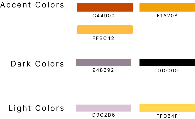
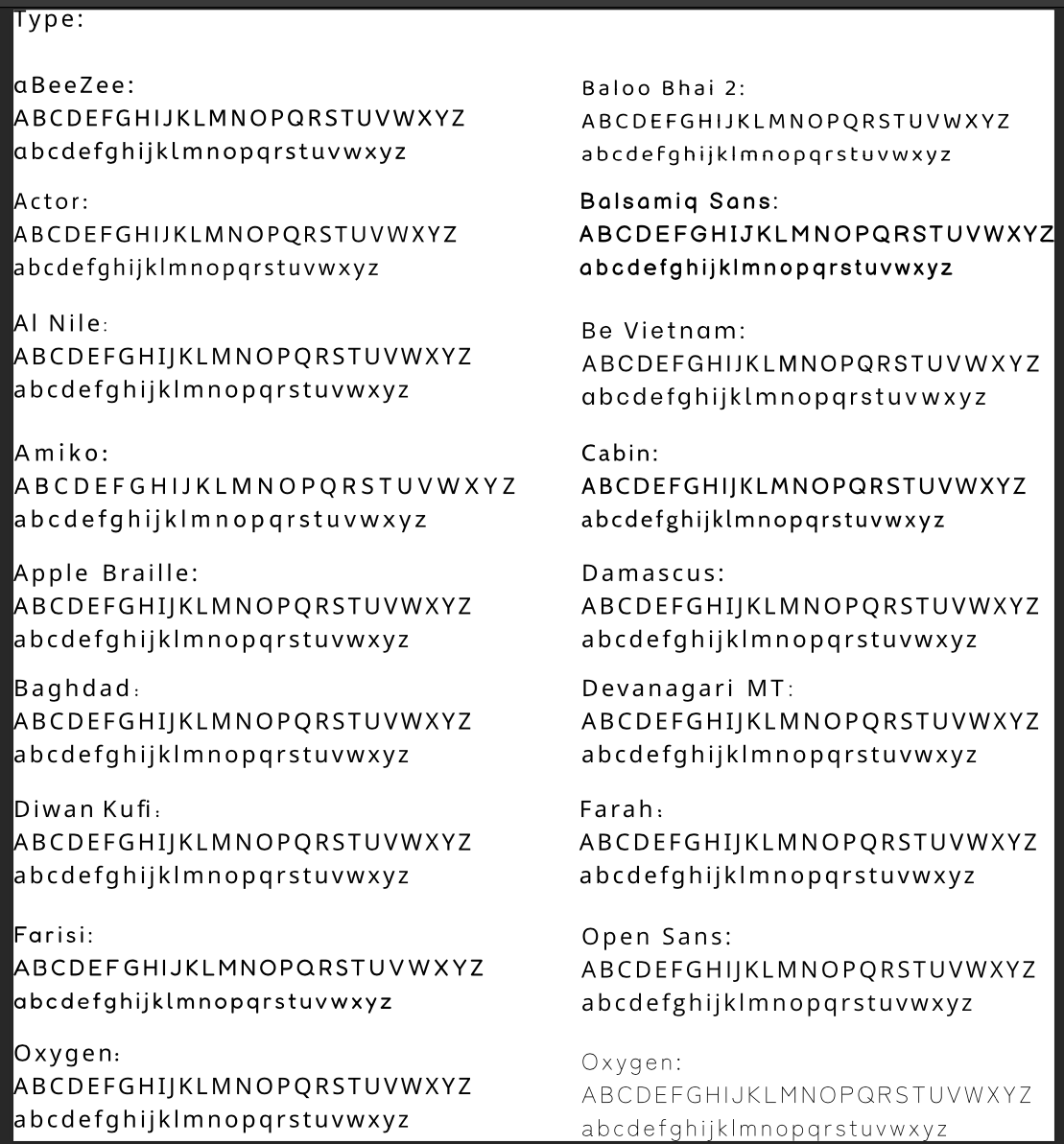
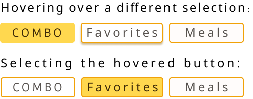
Color palette and Fonts
Color palette and Fonts
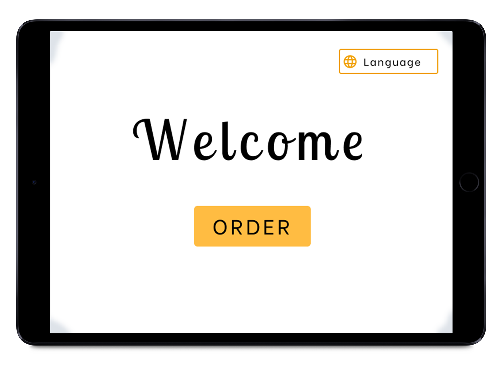
High Fidelity Frames
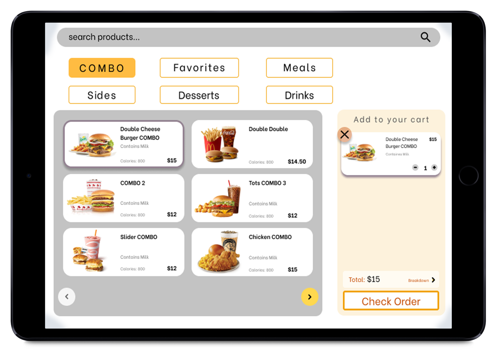
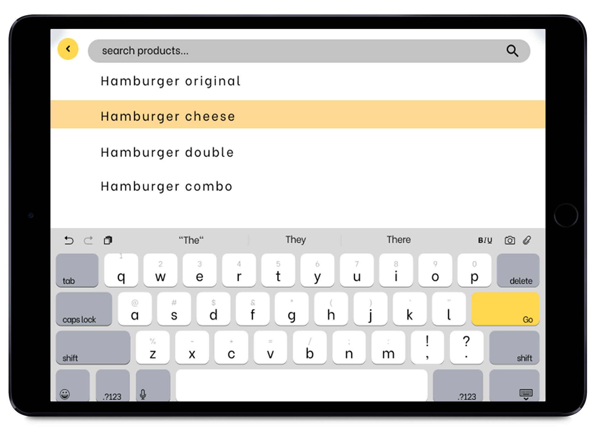
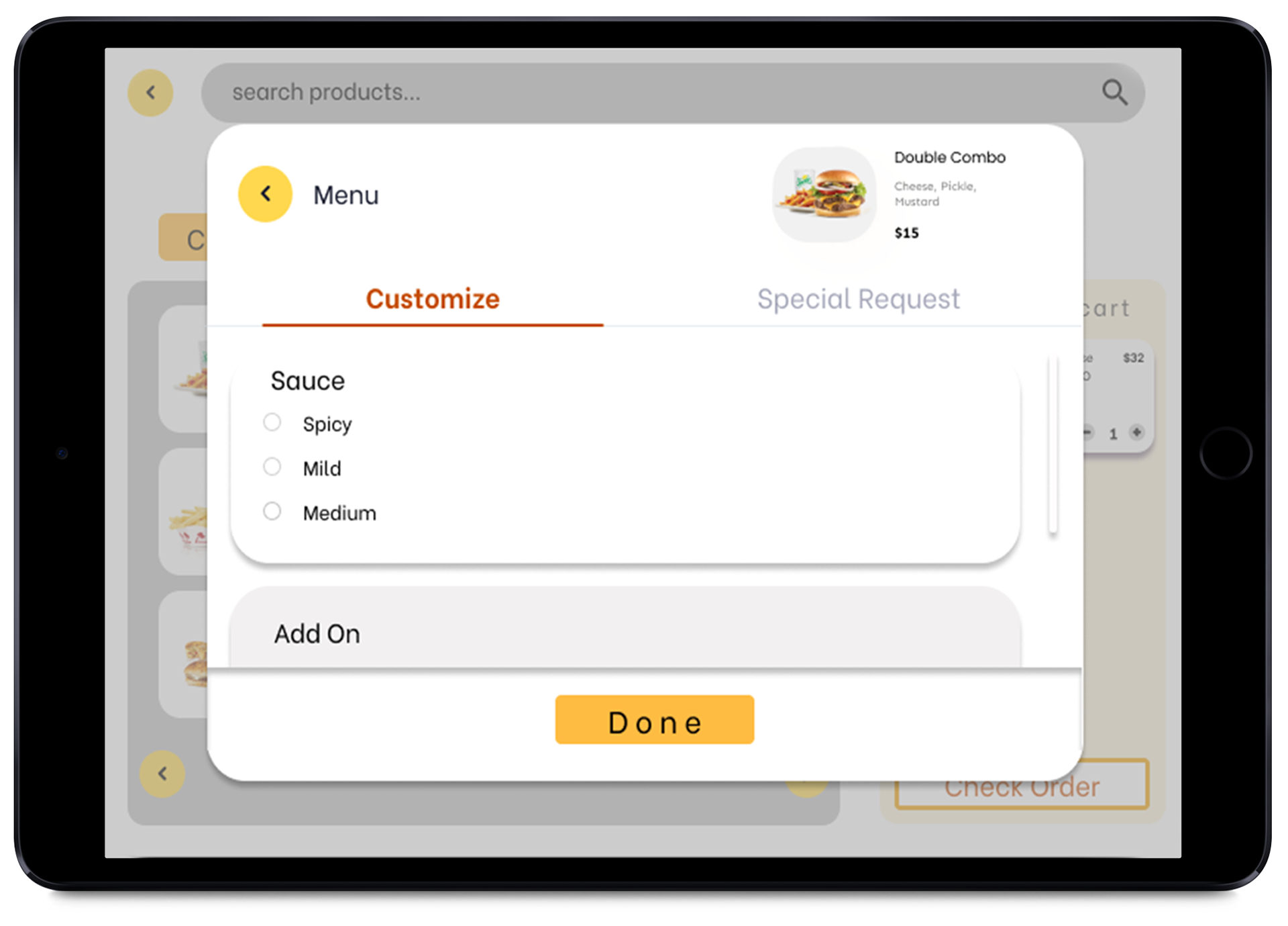
Usability Testing
Round 1
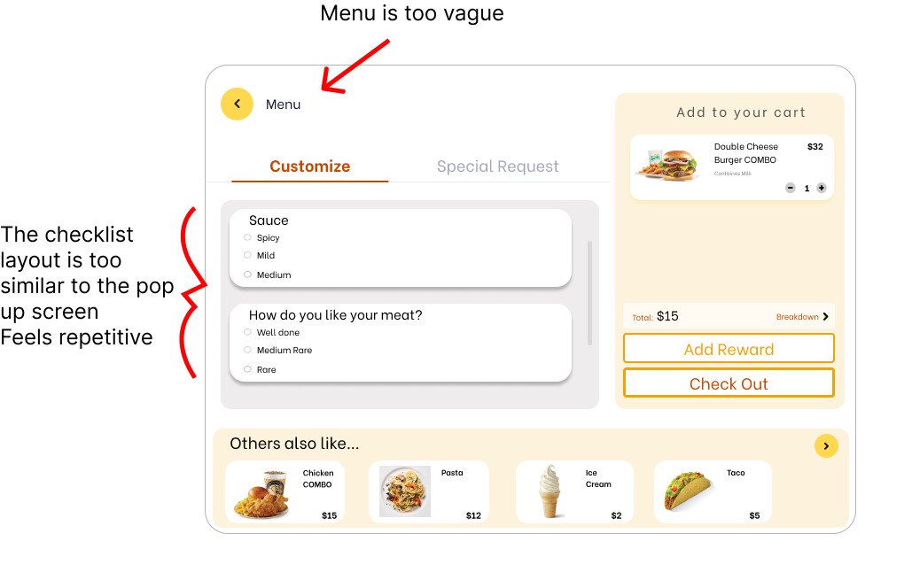
This is one of the participants I asked to participate in the usability test. They went over how they liked the menu layout but had concerns about the pop-up and checkout screens being too similar.
This is one of the participants I asked to participate in the usability test. They went over how they liked the menu layout but had concerns about the pop-up and checkout screens being too similar.
Improvements
Before
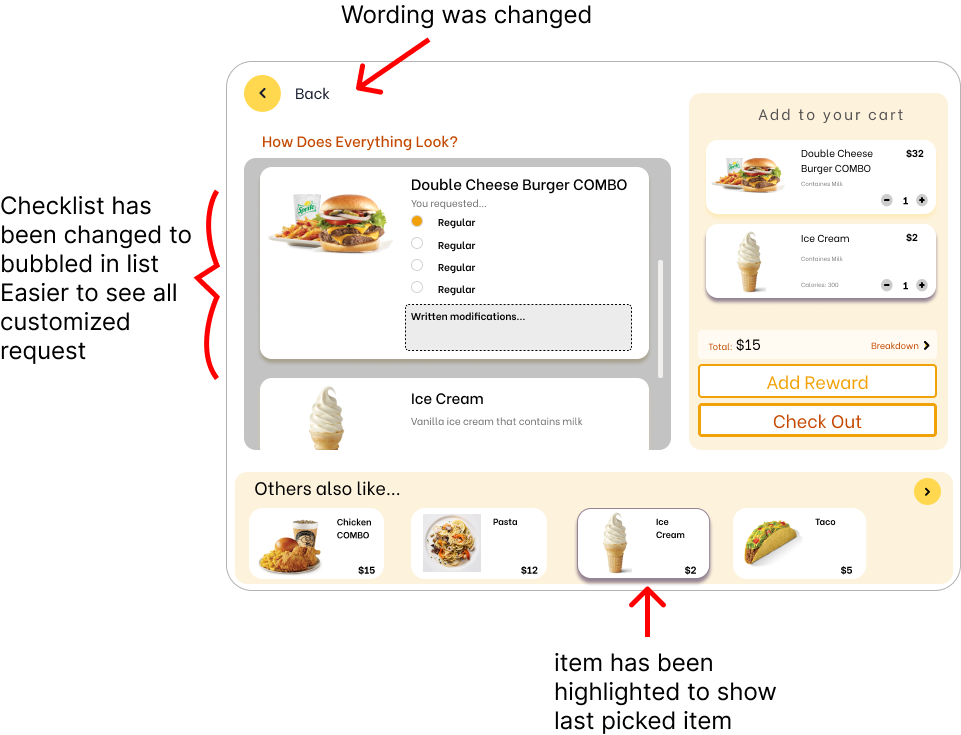
After
Usability Testing
Round 2
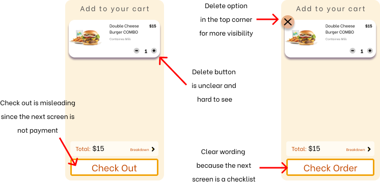
After editing and taking considerations from the first group of users, I changed the checkout screen, updated the bottom buttons so it was clear when a button was inactivated, and added a delete option in the corner of the item selection, creating an easier-to-read kiosk.
After editing and taking considerations from the first group of users, I changed the checkout screen, updated the bottom buttons so it was clear when a button was inactivated, and added a delete option in the corner of the item selection, creating an easier-to-read kiosk.
Prototype
To see the prototype interact with this embed code.
Tools: created on Figma
Tools: created on Figma