
Overview
WebWatch is a subscription-based platform that enables content creators to track the usage of copyrighted content and manage invoicing. I worked as a UX/UI Designer on a 4-week team project to redesign WebWatch’s MVP, improving usability, navigation clarity, and visual cohesion to increase creator trust and adoption.
Link to version test website (Open in new tab): Webwatch version test
Tools: Prototype created on Figma, logo created on Adobe Illustrator, Adobe Photoshop
My Role: UX/UI Designer
Focus: Research synthesis, heuristic evaluation, user flows, landing page UI, high fidelity prototypes
Team: 4 UX/UI Designers
Timeline: April 2024 - May 2024
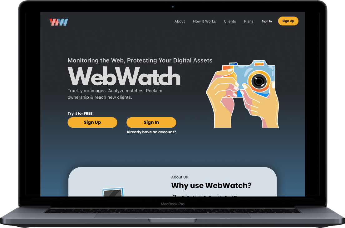
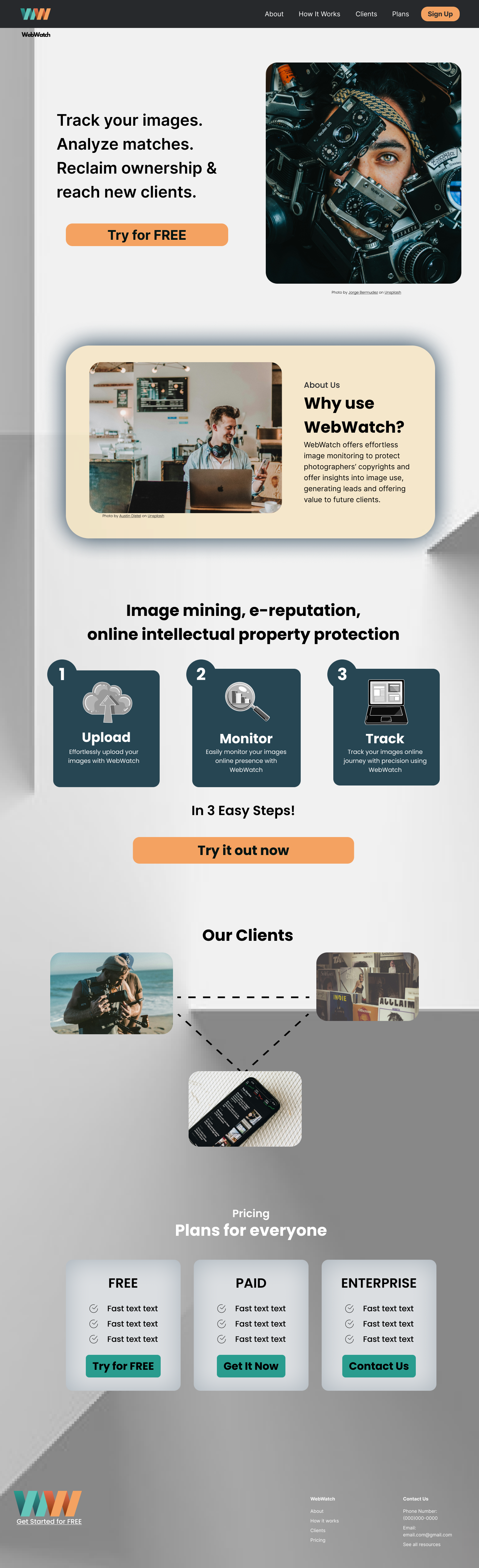
Old Landing Page

Prototype
Problem Statement
Creators struggled to understand how to upload content, track usage, and manage invoices due to unclear navigation, inconsistent labeling, and a lack of feedback within the MVP.
Creators struggled to understand how to upload content, track usage, and manage invoices due to unclear navigation, inconsistent labeling, and a lack of feedback within the MVP.
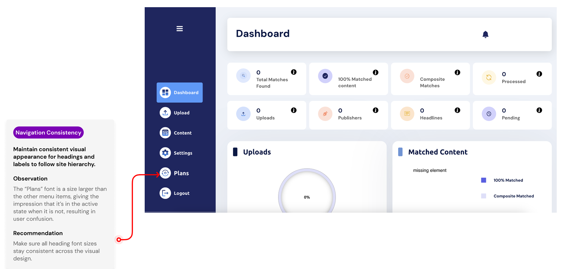
1. Heuristic evaluation revealed inconsistent terminology and unclear menu labels
2. Competitive analysis showed competitor platforms grouped creator actions more clearly
3. User interviews indicated uncertainty about “where to start” on the platform
Process
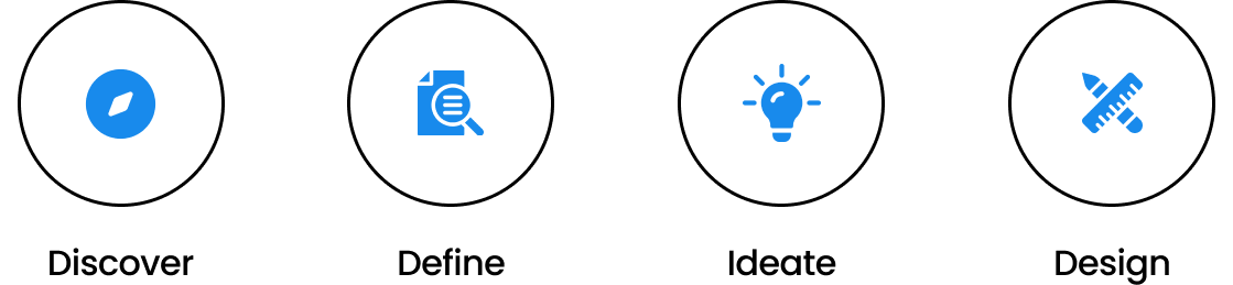
Research
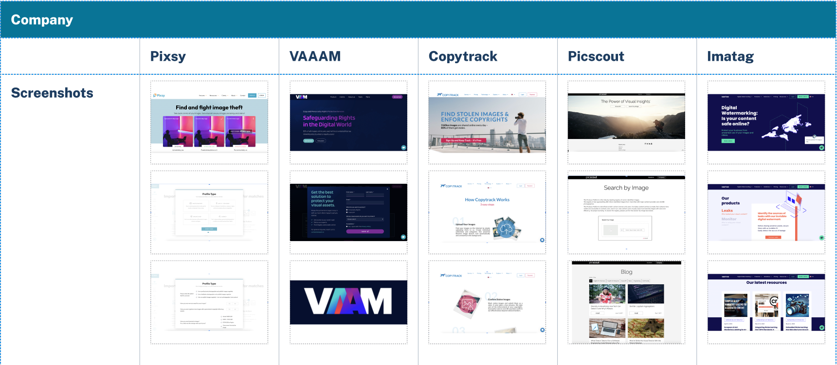
My team and I conducted a competitive analysis on other websites that the CEO had his eye on, so we went on those websites to break down the pros and cons of each platform
To see a more detailed version of the competitive analysis, click this link
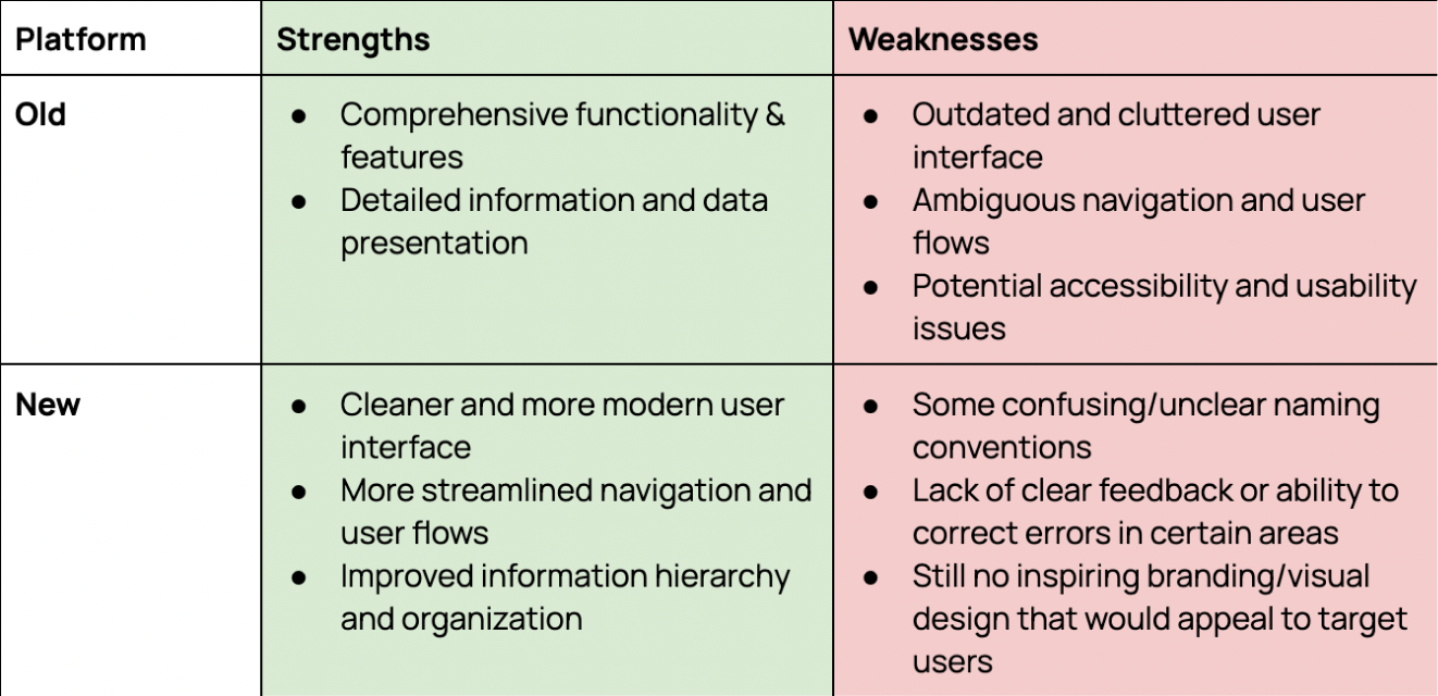
Heuristic Evaluation
My team and I then dissected the current Webwatch on what was working and what needed improvements to show to the CEO in the next meeting, so that we could share our knowledge on what would benefit the users best with the evaluation we created.
This evaluation aimed to identify strengths, weaknesses, and areas for improvement in the new design to guide the development of the next version of the Minimum Viable Product (MVP).
To see a more detailed heuristic evaluation of the new platform, click on this link
To see the heuristic evaluation on the old platform, click this link
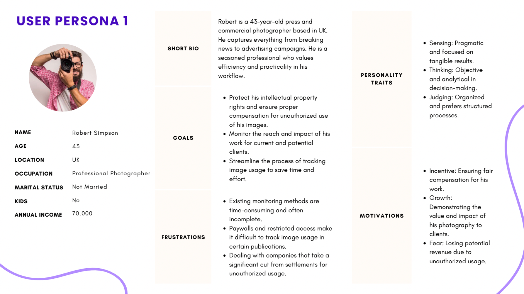
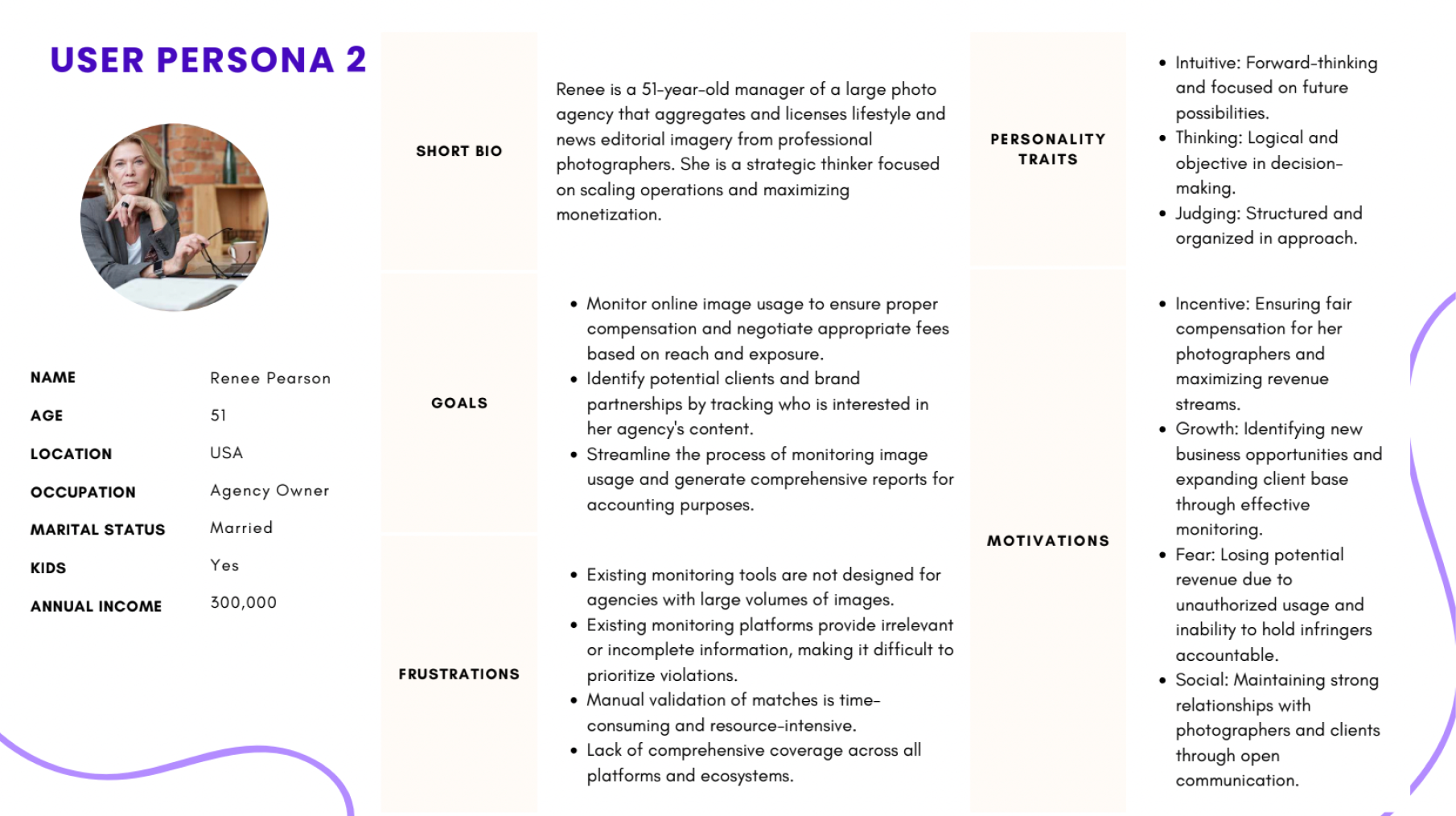
User Research
User research is required to validate the design decisions and ensure the platform meets the needs and expectations of its target audience, starting with photographers worldwide.
We created a user interview script with questions about the main focuses these users needed/wanted. My team and I would then conduct video interviews with these users and take extensive notes on each participant.
Key Research Insight
- Creators needed clear confirmation on when content was uploaded or tracked
- Users felt unsure what actions triggered invoicing
- Competitor platforms succeeded by emphasizing visibility, control, and transparency
- Users wanted a simple dashboard over feature-heavy screensPersonas
We used personas to prioritize clarity and control for photographers, which guided decisions around dashboard hierarchy and upload flows.
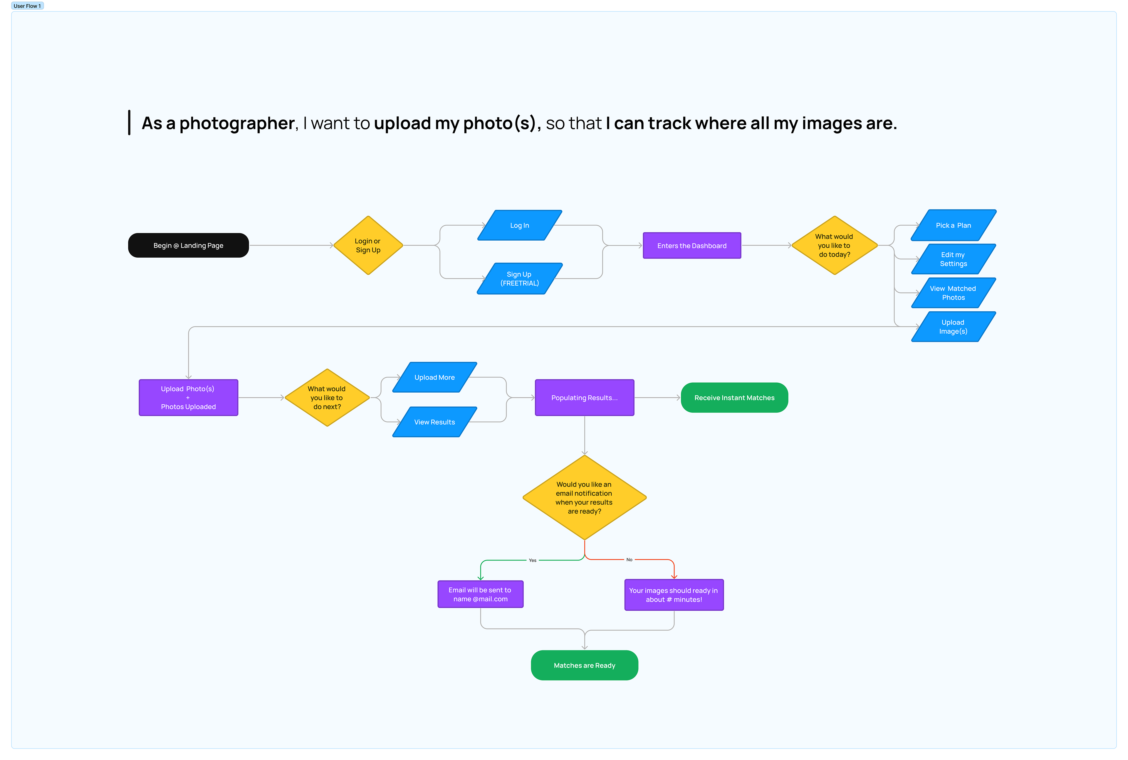
User Flow
The user flow aims to deliver a seamless and intuitive user experience, enabling effortless navigation, easy access to features, and efficient task completion. These flows helped us reduce unnecessary steps and informed the final dashboard layout and navigation structure.
Click on this link to view it on a different screen
Sketches
These sketches are a combination of each collaborator’s sketches and ideations.
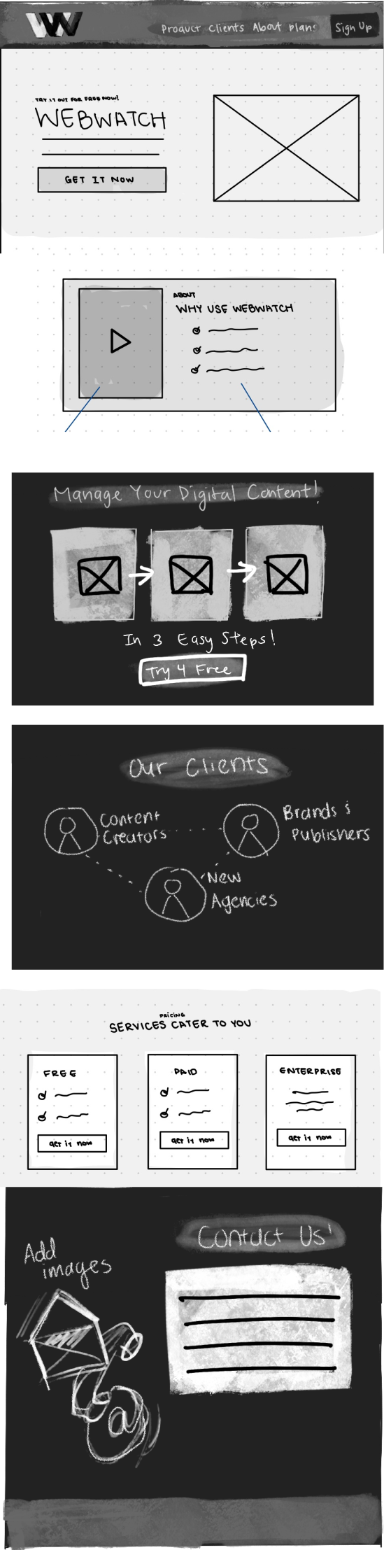
Landing Page
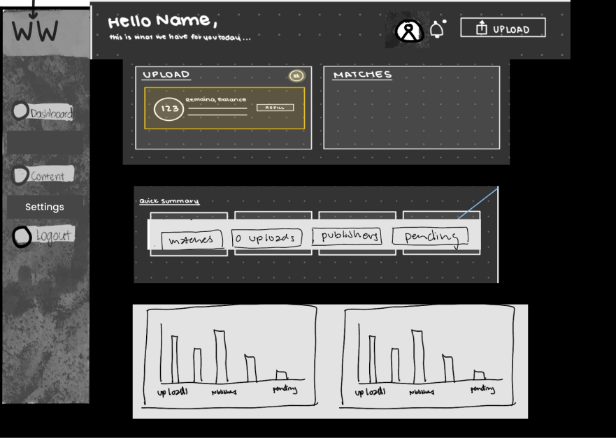
Dashboard
Style Guide
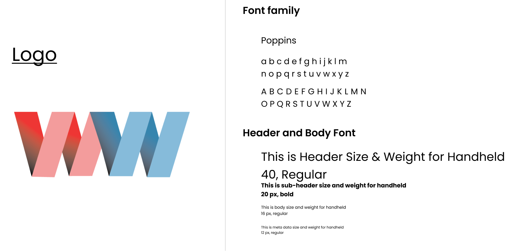
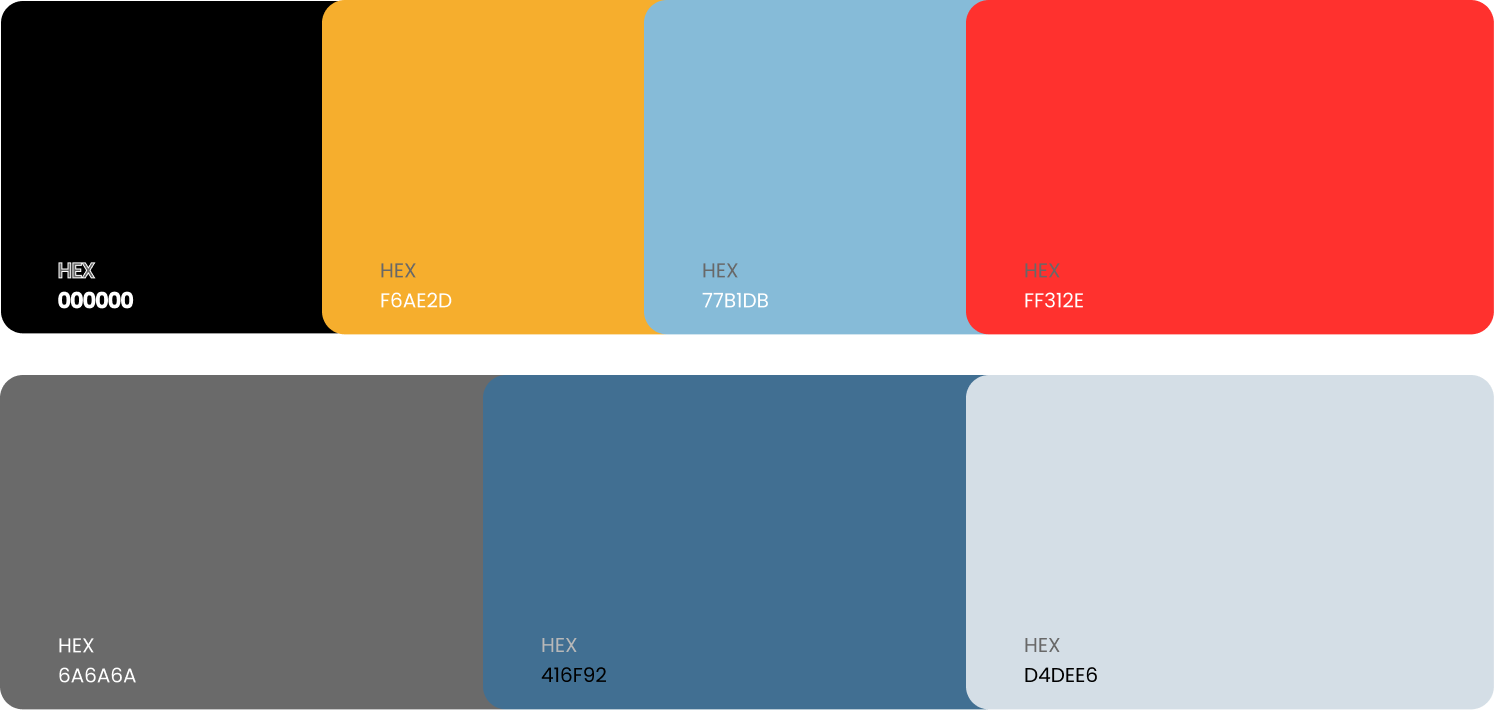
Colors
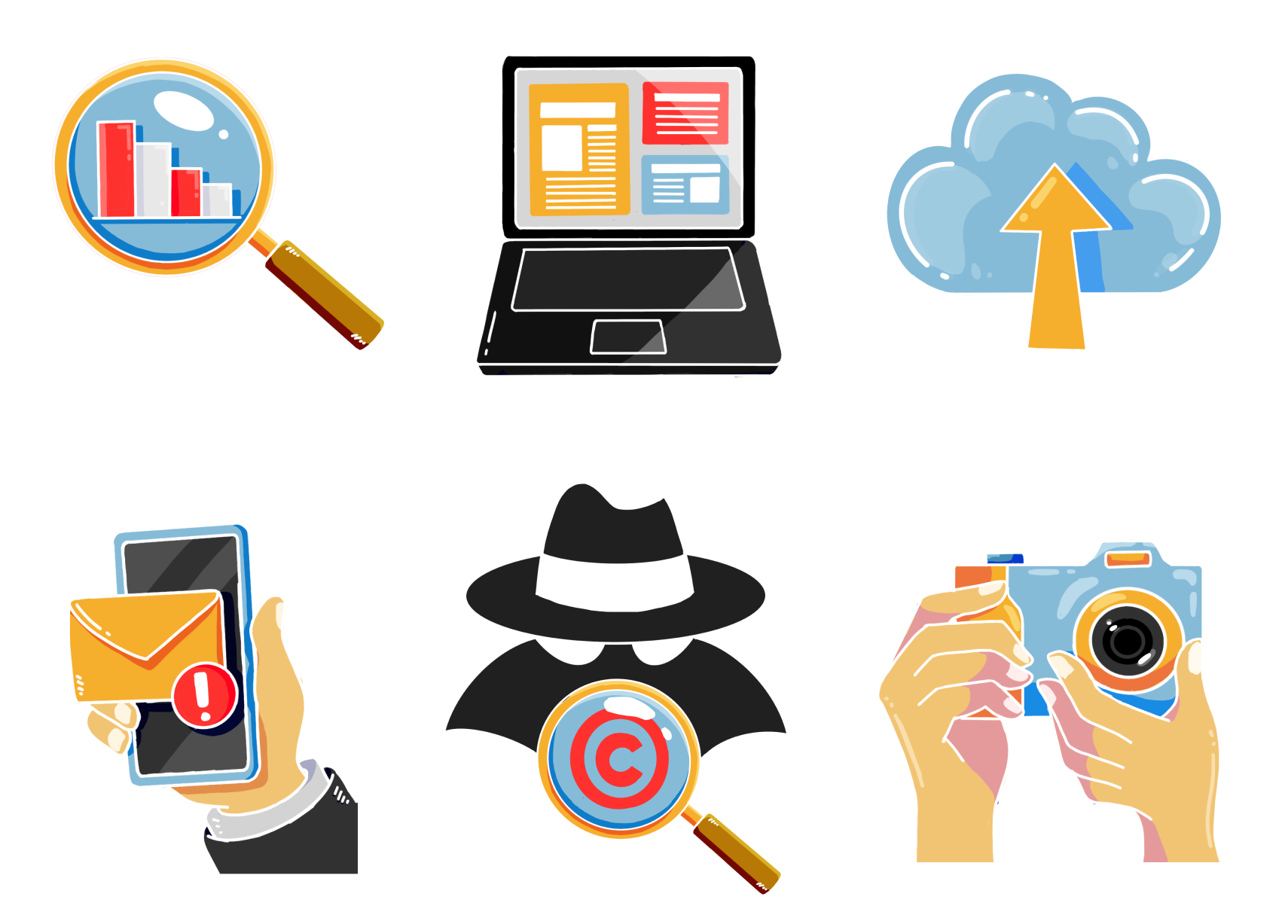
Illustrations
As a team, we were deciding whether photographs or illustrations would better represent the brand. After discussing it further with the CEO, he ultimately felt the illustrations best represented the brand.
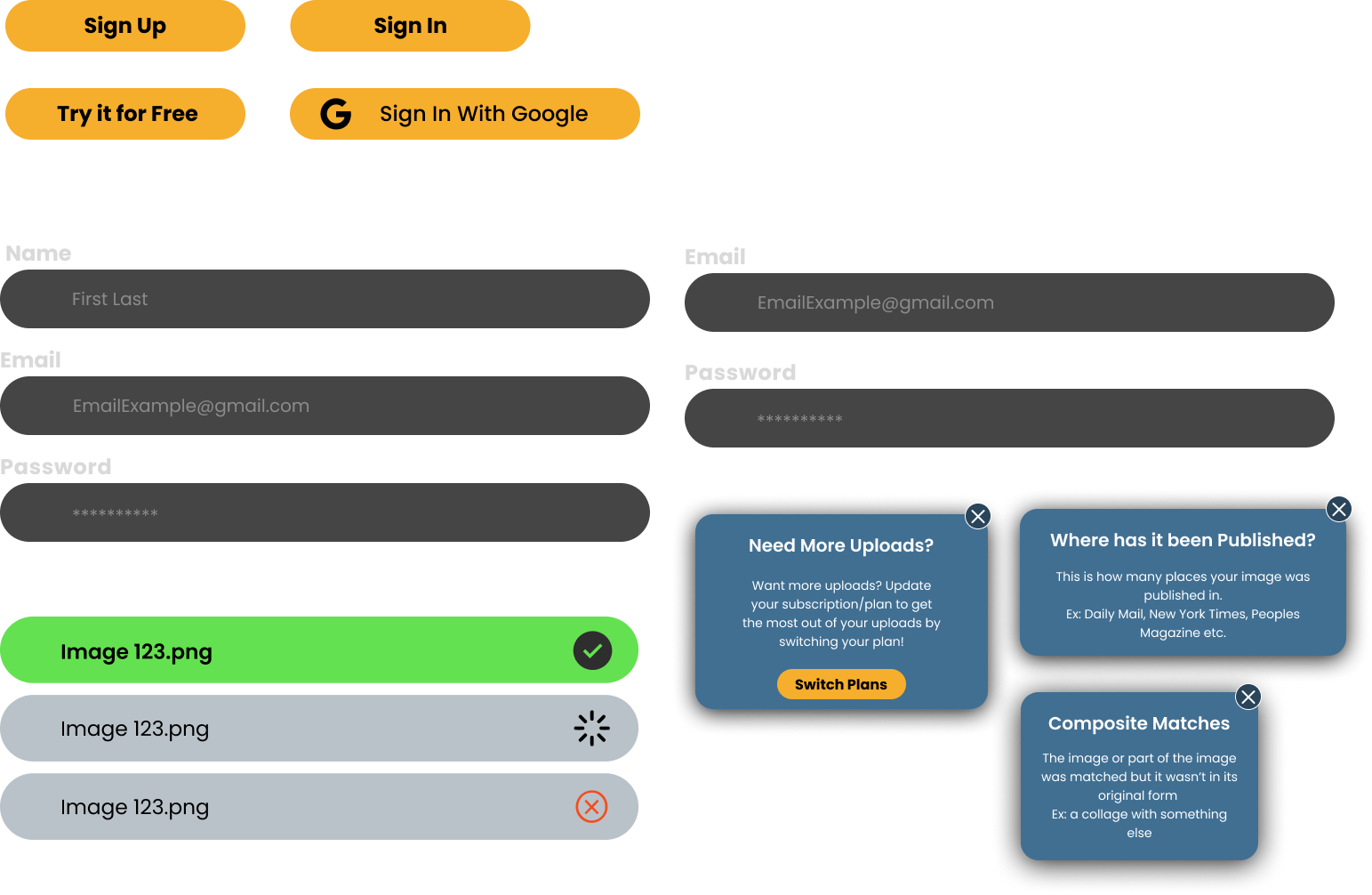
Buttons/Other Elements
Solution
- Clarify the platform's labeling, terminology, and messaging to ensure clarity and consistency. This is based on user confusion during user interviews
- Implement clear feedback mechanisms and confirmation for important user actions.
- Refine the information architecture and content organization to improve discoverability.
- Optimize navigation and user flows based on common tasks and user journeys. This was informed by heuristic issues with discoverability
- Ensure accessibility compliance and best practices are followed throughout the design. This is to support global creators
- Enhance visual design and aesthetics for a more polished and cohesive experience.
- Incorporate user preferences and customization options where appropriate.
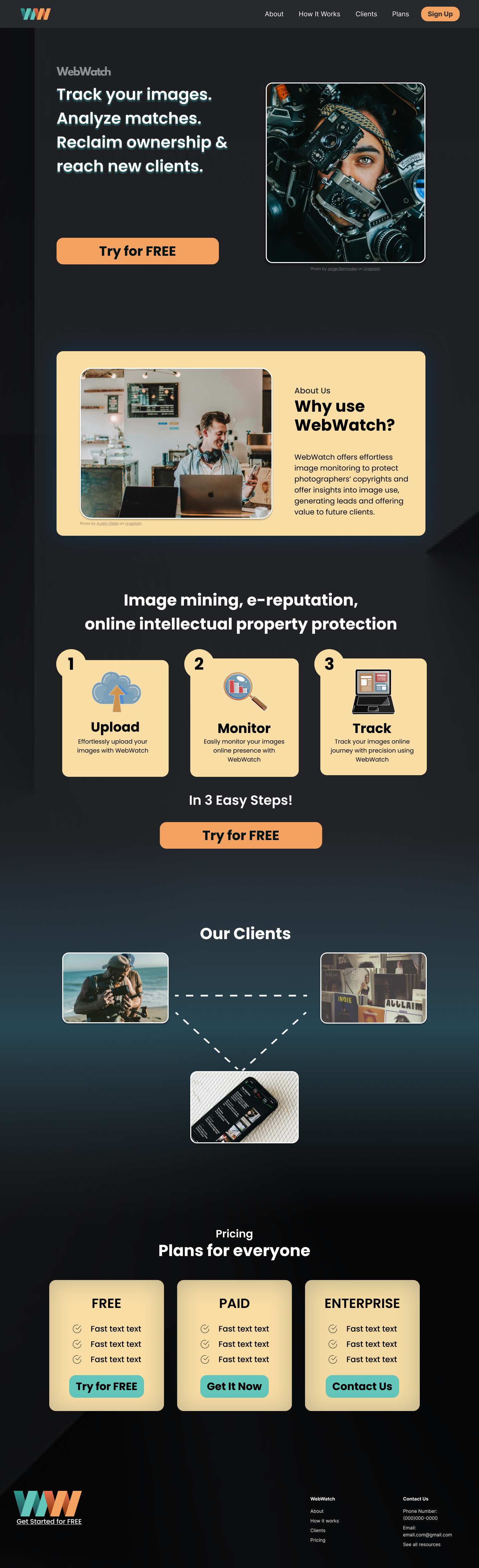
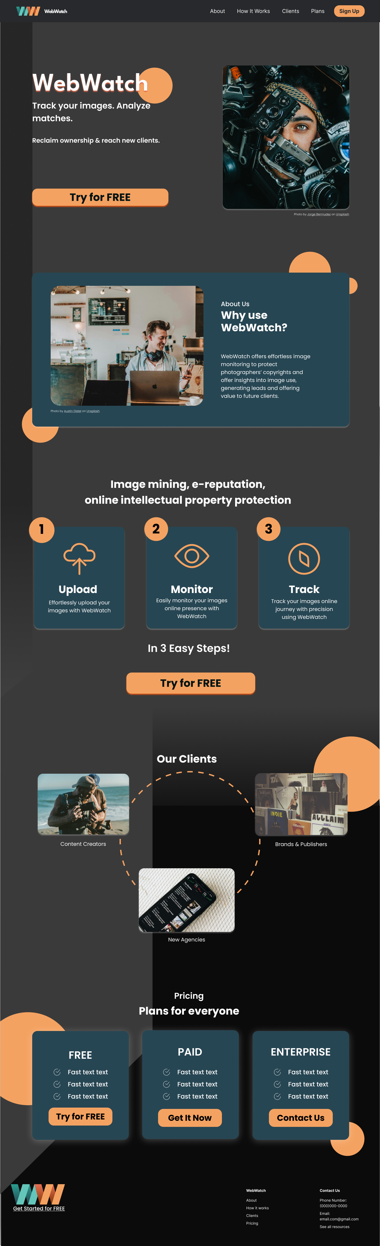
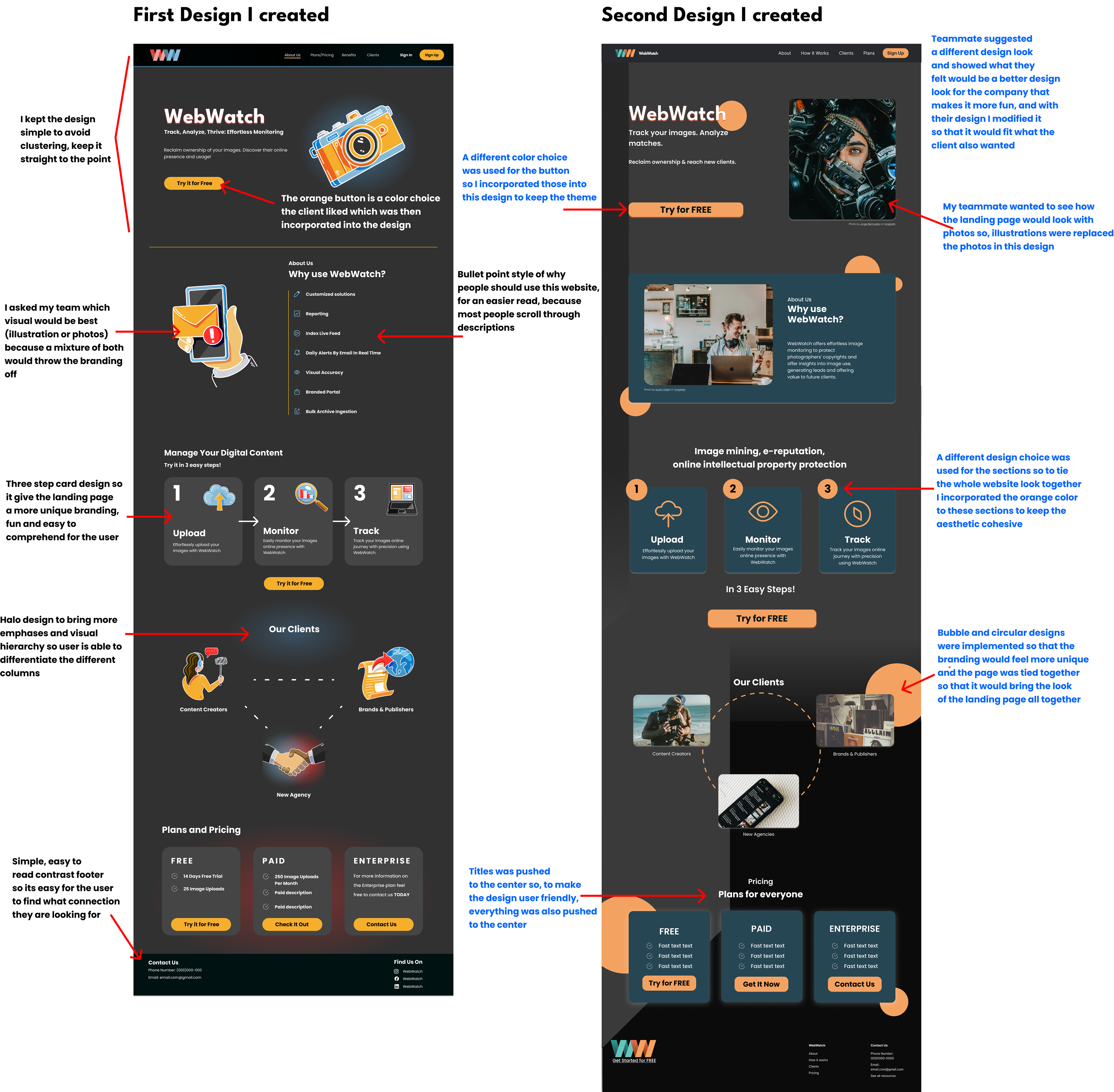
Landing Page Design Variations
My team and I decided to design our versions of what we felt Raj wanted the aesthetic of the brand to be through the landing page. I communicated with my team about what I felt made sense visually for my pages and asked for insight into what they felt worked best, so that the page I designed still collaborated as a team, as I also made decisions about what would be user-friendly.
Explanation Of My Design Choices
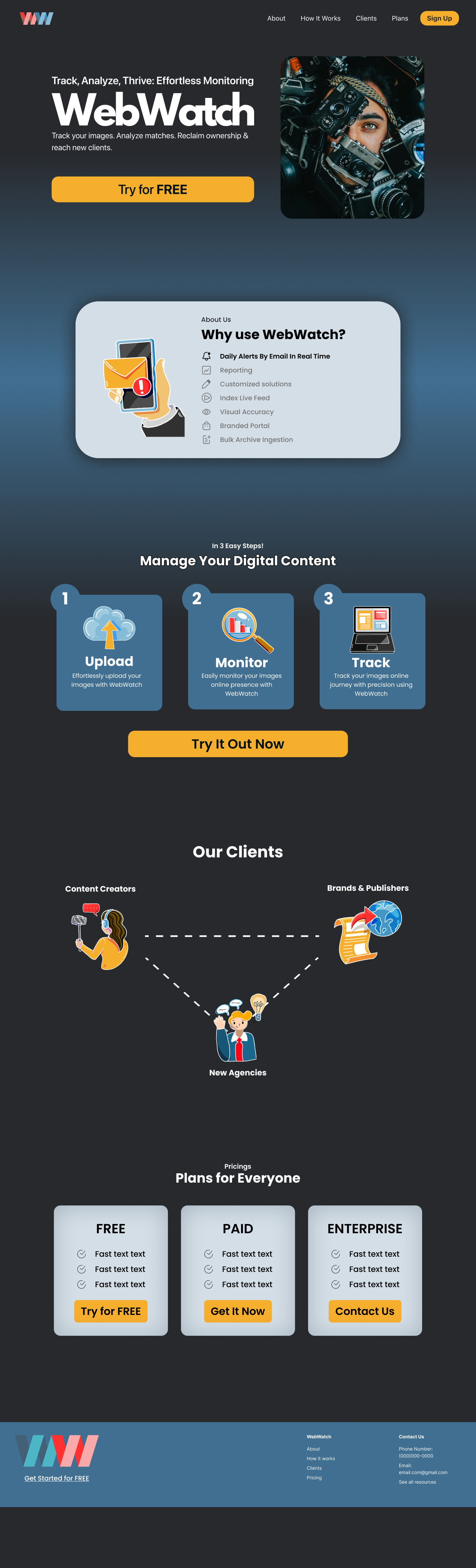
High Fidelity Screens
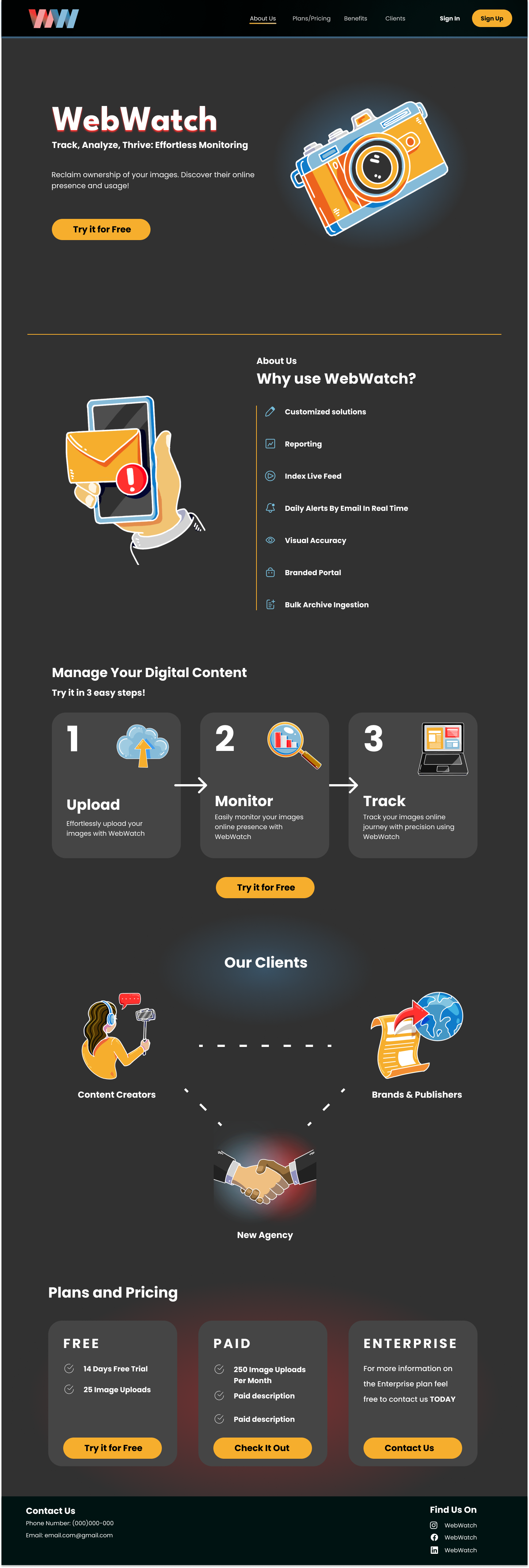
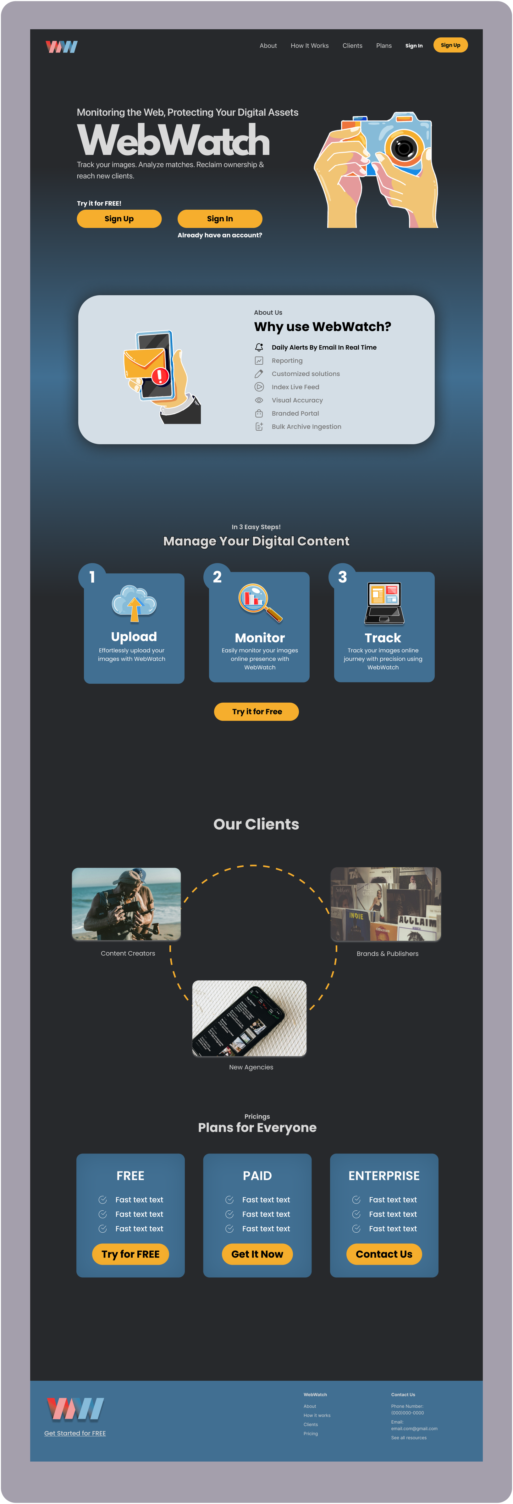
What the client picked and chose from the designs we created, and this is what the ultimate landing page looked like.
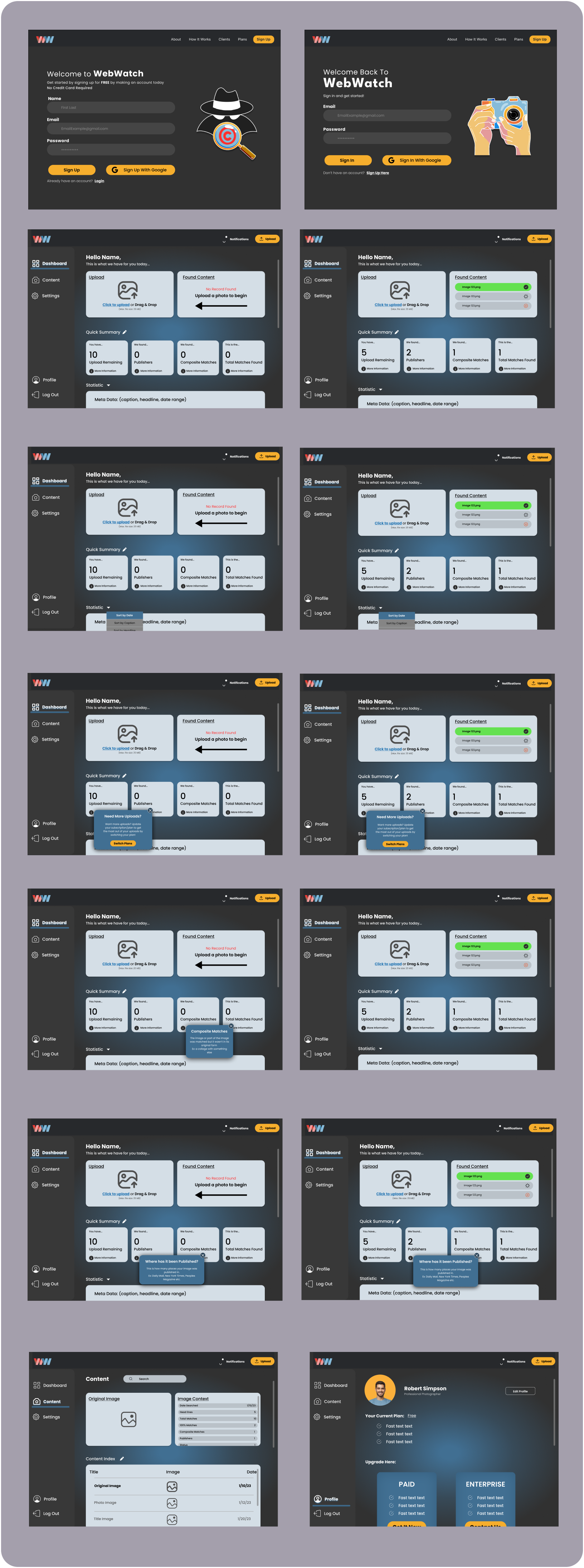
Sign Up and Dashboard Designs
Reflection
What I learned:
What I learned:
- How to balance CEO vision with user needs
- How heuristic evaluations can guide MVP decisions
- How collaboration improves design outcomes
What I'd improve next:
- Usability testing on the dashboard
- Metrics for adoption and task success
- Iteration on onboarding flows